This site uses cookies to improve your experience. To help us insure we adhere to various privacy regulations, please select your country/region of residence. If you do not select a country, we will assume you are from the United States. Select your Cookie Settings or view our Privacy Policy and Terms of Use.
Cookie Settings
Cookies and similar technologies are used on this website for proper function of the website, for tracking performance analytics and for marketing purposes. We and some of our third-party providers may use cookie data for various purposes. Please review the cookie settings below and choose your preference.
Used for the proper function of the website
Used for monitoring website traffic and interactions
Cookie Settings
Cookies and similar technologies are used on this website for proper function of the website, for tracking performance analytics and for marketing purposes. We and some of our third-party providers may use cookie data for various purposes. Please review the cookie settings below and choose your preference.
Strictly Necessary: Used for the proper function of the website
Performance/Analytics: Used for monitoring website traffic and interactions
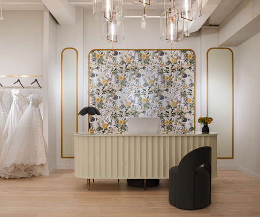
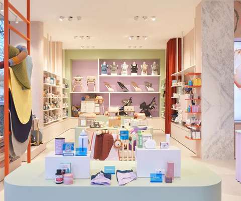
Brides from across the nation and beyond come to immerse themselves in its carefully curated space and, if fortunate, to work directly with Mr. Ingram himself. To elevate the experience, Hao designed the space with intentional flow, guiding each bride through a journey from the reception area to lounges and dressing rooms.
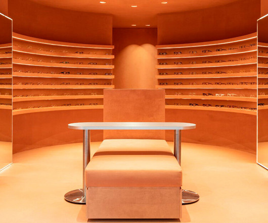
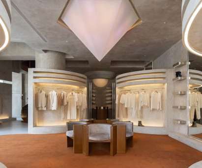
symmetrical layout by el departamento unfolds into a semicircle. The post monochromatic terracotta interiors by el departamento adorn new optical boutique in spain appeared first on designboom | architecture & design magazine.
The interior design of the store is a collaboration between Valencia-based Carmen Baselga Taller de Proyectos and Lladró’s store engineering team. This new retail concept is also being rolled out in select Lladró spaces and pop-ups around the world, including Beijing, Berlin, and Venice.
Walking into the 1172-square-foot space designed by Ringo Studio, consumers are greeted by a 16-foot- long custom table with marble insets, anchored by a dramatic light fixture. This store is more than a retail space; its an immersive experience that blends innovation with nature.
Sci-fi film 2001: A Space Odyssey influenced the design of this coffee shop in Miami Design District , created by NBA star Jimmy Butler and design agency DE-YAN. Ready-to-drink beverages are stored inside chillers The logo is also enlarged and applied to the pill-shaped drop ceiling above the counter, positioned in the centre of the space.
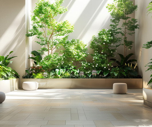
Bringing the outdoors in, will continue to be seen across all types of interior environments. How are you bringing natural materials, daylight, plantlife, images of nature, and fresh air into your selling space? Color palettes & earthy tones are in – creating mysterious, warm, safe spaces. Bold is also in!
You may dream of opening a quaint little restaurant that offers something different from the cookie-cutter interiors and services of the big chains. However, the small square footage of such a restaurant may come with challenges.
Both drawing up a retail store design from scratch and revamping an existing store layout require a basic understanding of the retail store layout options available to you. Below, you will learn what a retail store layout is, what makes a retail store layout so important and the seven most common types of retail layouts.
While it’s often associated with creating attractive commercial spaces , this field encompasses so much more. From architecture and interior design to marketing, Retail Design is far more than just about stores. From architecture and interior design to marketing, Retail Design is far more than just about stores.
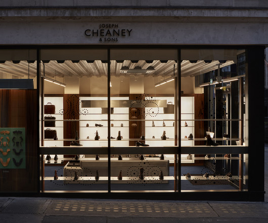
The boutique combines the heritage of English shoemaking with a sleek, contemporary interior that feels almost gallery-like. Natural light flows abundantly through the store’s fully glazed elevations, bouncing off strategically placed mirrors and light boxes to create an atmospheric depth to the space that exudes a sense of timelessness.
Cobalt blue floors, reflective chrome furniture and a column of yarn balls come together to create the futuristic interior of the Nezo boutique in Mumbai by local studio Sanjay Puri Architects. The showroom was envisioned as a dynamic and forward-thinking space that embodies boldness, vibrancy and empowerment."
meters of usable space on the ground floor, Modum Atelier created an open-air corridor that connects the street to a hidden courtyard. Weathering steel frames the boutique's windows On the upper floor, the L-shaped interior of the boutique has a wooden pavilion elevated on short columns at its centre. With only 3.5
Whether you are doing a full home improvement project or just want to boost your own interior design choices, using cabinets well is an important part of building the aesthetic that you are looking for. Consider a living room space. Placement also impacts the way the cabinet fits into a space. Why Are Display Cabinets Important?
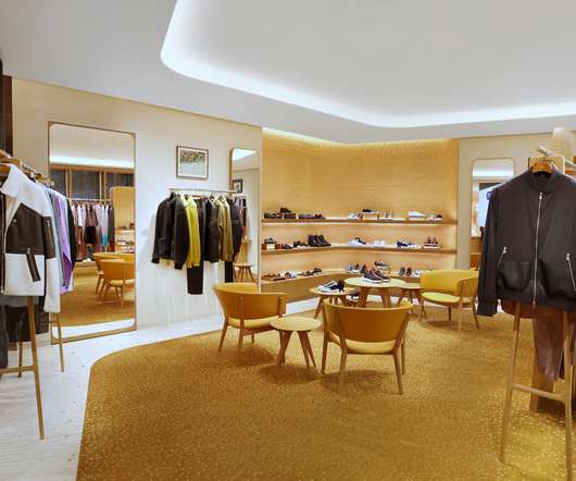
Awash with light and recast in a warm, welcoming colour palette, the new store boasts a spacious layout where one can discover the sixteen métiers of the house and the spirit of savoir-faire and innovation at the heart of Hermès. Unique cultural references are instilled in bespoke design features of both the interior and exterior.
Some of them are tried and true, such as store layout and design, customer service and convenience. Store layout and design Store layout and design are basic, yet essential factors in creating the initial impression and introduction to the store. A look at July’s interiors. Don’t be complacent in this area.
A curvilinear thatched hut has been paired with terracotta-hued tiles at the Amsterdam store for homeware brand Polspotten, which was designed by local studio Space Projects. The hut provides a meeting space for colleagues, according to the studio founder. The thatch, as a natural material, absorbs sound as well," explained Smit.
French interior design Studio FB and the co-founder of fashion brand Frame, Erik Torstensson, have designed a California-informed store for the brand in London. We imagined this new concept design layout as open as possible, which can be compared to a gallery." The photography is courtesy of Frame.
The design scheme employs subtle, subliminal hints that encourage people to explore the space: ample circulation space, and nooks that unfold within a meandering layout. . Derived from an open plan, this layout determines the viability of success for the design of the store. Principal Architect – Priya Doon.
Embodying the brand’s ideals, which fuse a love of beautiful, master-crafted furniture with an appreciation for the rhythms of nature and how the changing seasons can refresh our spirits and living spaces, the Leamington Spa store will be a wholly new offering from the brand.
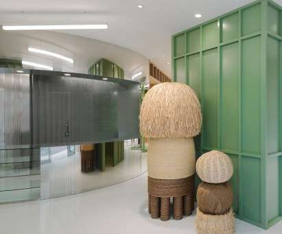
Russian architect Elena Lokastova has turned the attic space of a Moscow office building into a jewellery showroom with green-carpeted interiors, informed by the patinated copper dome of a monastery that can be seen from the window. A linework mural by graphic designer Ivan Kornienko conceals an integrated storage space.
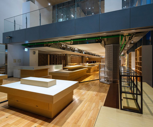
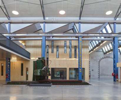
The Ateliers des Capucins has been shortlisted for a Dezeen Awards 2020 in the large workspace interior category. The studio's brief was to design a number of shells in order to create an interior street with two floors inside the historical arsenal building, covering 5,000 square metres. Some facades are as tall as 13 metres. "In
Green timber storage features throughout the store's interior. Perron-Roettinger , founded by Willo Perron and Brian Roettinger, wanted to create a store interior that encourages circulation and interactivity. There isn’t a single way to navigate through and shop the space," he continued.
British architecture studio Al-Jawad Pike has used colourful marble for the interiors of trainer brand Athletic Propulsion Labs’ second flagship store in Soho, New York City. We wanted to create a wash of light from above to bath the space in a warm and comfortable ambience," said Al-Jawad. "At
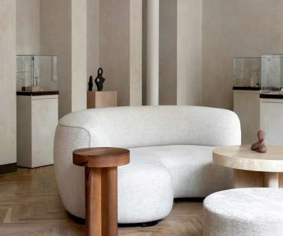
Located on Ny Østergade in the city's old town, the flagship store belongs to jewellery brand Dulong and features an open-plan layout broken only by a few existing cast-iron columns. Its "serene, soft and welcoming" interior is arranged much like a living room, with a curved sofa and round coffee table at its centre.
IS Architecture and Design was briefed to turn a disused gym into a space age hair salon. The result is a maximalist set of spaces which Rockwell says “celebrates the spirit of carefree sophistication” Several site-specific installations have been designed as feature points.
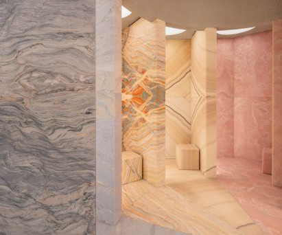
A palette of plaster, marble, terrazzo and stainless steel was chosen to create interiors that customers want to "reach out and touch" in this Dublin skin clinic by Kingston Lafferty Design. Above: its retail space features marble counters. The interior of the arch is finished with terracotta-coloured tiles.
As this is the bathroom brand's US flagship – and currently its only standalone space – McLaren Excell set out to develop an interiors scheme that "deviates from the typical showroom format". The showroom's floor plan is loosely informed by the layout of a church. At the rear is a concrete counter denoting the brand's name.
The brand’s core values are translated into the interiorspace in terms of authenticity, innovation, and an on-trend quirkiness. Surrounded by verdant greens adjacent to two façades, the 15-seater teahouse provides ample floor height inside, countering the small footprint and lending the interiors a grandness in volume.
There was a pin-drop moment, where I was like, ‘There isn’t a Mecca in the baby space’,” Casey recalled. My favourite part of the store is the health and recovery space, which you probably won’t find in the traditional retailers. There’s even a space if you need to feed your baby.”. All about the flow. By women, for women.
The food experience has been wrapped into an iconic space arrangement, featuring an eye-catching floating bridge that connects the main levels at the centre. . The Flexstore offers retailers the opportunity to adapt the store layout as required and to quickly change modules in a cost-effective manner.
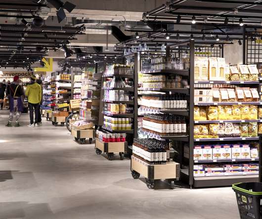
Unlike most retail stores, supermarket layouts are based on an incredible amount of consumer and scientific research, so redesigning stores in this sector is limited by well-defined operational rules and procedures. The Chadstone revamp was about discovering small things to tweak to provide an enhanced overall customer experience.
Retail spaces have very specific needs because they’re interacted with by the public on a frequent basis. Therefore, everything from the layout of the space to the materials used needs to make it easier for customers to navigate and shop as well as for the space to gain as much brand recognition as possible. .
Embracing the spirit of the millennial generation, the restaurant creates a space where patrons can freely express themselves and connect with like-minded individuals. Careful attention has been paid to every detail, from the font selection reminiscent of French bistros to the strategic use of brand colours throughout the interior.
Through simple, actionable strategies such as light, color, space, and layout, designers can create stronger, healthier workplaces. Through simple, actionable strategies such as light, color, space, and layout, designers can create stronger, healthier workplaces. Architecture is, at its core, about people.
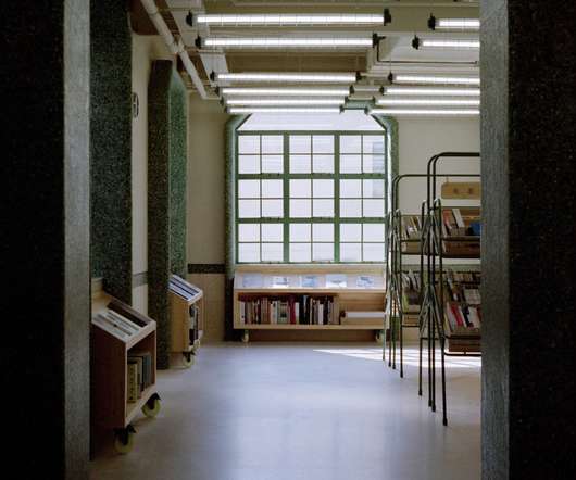
As inspiration for the project, we looked thoroughly at spaces that are a book-lover's paradise – the library," Norm Architects co-founder Jonas Bjerre-Poulsen told Dezeen. "We The space was relatively small and with its high ceilings, it had an almost silo-like feeling," Bjerre-Poulsen said. Oak panels give the space an organic feel.
Like most brands in the outdoor space, we have seen strong sales growth in our market during and post-Covid,” he said. “As Features include natural plywood interiors – which are contrasted against dark charcoal backdrops – modern down lighting, and hero feature walls.
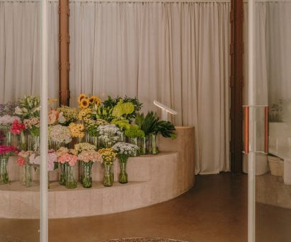
Earth-coloured concrete , red-hued marble and gravel are combined in Alblanc Atelier, a garden-like flower shop interior in Madrid by local practice Plantea Estudio. Alblanc Atelier is based in the city's Justicia neighbourhood, and prior to Plantea Estudio 's renovation the space was empty, punctuated only by two structural metal columns.
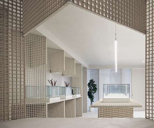
Grand steel and micro-cement structures, celestial lighting and symmetrical layouts add a sense of ceremony to the shopping experience within this clothing boutique in Hangzhou , China by Liang Architecture Studio. The store features curved interiors. The store interior was informed by retrofuturism.
On the interior, Chinese architecture studio Offhand Practice hoped to create a relaxed shopping environment despite the large number of goods on offer, which includes more than 2,000 pieces of clothing. Read: AMO cocoons Jacquemus store in pillows to create "bedroom-like" interior.
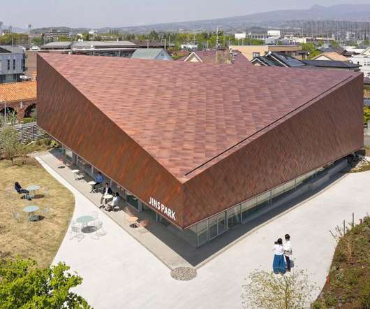
Named JINS Park, the shop in Gunma Prefecture was designed to act as a space for the community to gather whether they are shopping in the store or not. “We proactively created public spaces that are not part of the sales floor, which encourages community members to come for reasons other than shopping,” the studio explained.
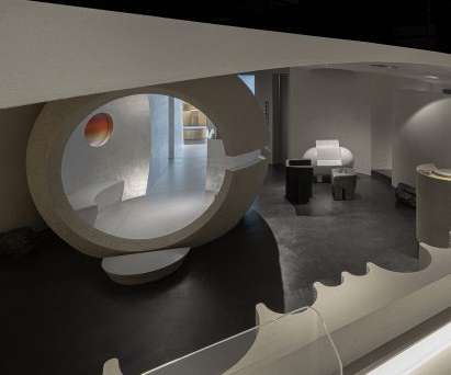
A spherical gateway and otherworldly light reflected through glass prisms feature in this skincare store in Hangzhou , China, which local interiors studio Lialawlab has designed around the theme of retro-futurism. Textured grey paint defines the space. A spherical volume forms an entrance to the store's more private spaces. "To
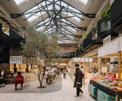
The same recycled red bricks sourced from demolished houses in China can also be found on the interior walls, stacked to create three dimensional patterns. The interior of the market was designed to resemble a greenhouse, with shops and cafe's arrranged around a central, double-height atrium. The photography is by Wen Studio.
How can you optimize a store’s counter space to sell more of your products? Learn about the best ways to optimize a checkout space and convert more customers into loyal buyers below. Why Promote Products at a Checkout Counter Space? What Types of Displays Work for a Checkout Counter Space? Travel-sized products.
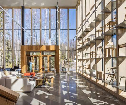
The entrance features glass curtain walls that connect the interior and exterior. Avanto Architects designed the 12,000-square-metre building to blend into the forest as much as possible — a challenge given its massing, a product of the warehouse layout. Wood is featured throughout the interior. Photo by Kuvio. Photo by Kuvio.
We organize all of the trending information in your field so you don't have to. Join 29,000+ users and stay up to date on the latest articles your peers are reading.
You know about us, now we want to get to know you!
Let's personalize your content
Let's get even more personalized
We recognize your account from another site in our network, please click 'Send Email' below to continue with verifying your account and setting a password.


Let's personalize your content