This site uses cookies to improve your experience. To help us insure we adhere to various privacy regulations, please select your country/region of residence. If you do not select a country, we will assume you are from the United States. Select your Cookie Settings or view our Privacy Policy and Terms of Use.
Cookie Settings
Cookies and similar technologies are used on this website for proper function of the website, for tracking performance analytics and for marketing purposes. We and some of our third-party providers may use cookie data for various purposes. Please review the cookie settings below and choose your preference.
Used for the proper function of the website
Used for monitoring website traffic and interactions
Cookie Settings
Cookies and similar technologies are used on this website for proper function of the website, for tracking performance analytics and for marketing purposes. We and some of our third-party providers may use cookie data for various purposes. Please review the cookie settings below and choose your preference.
Strictly Necessary: Used for the proper function of the website
Performance/Analytics: Used for monitoring website traffic and interactions
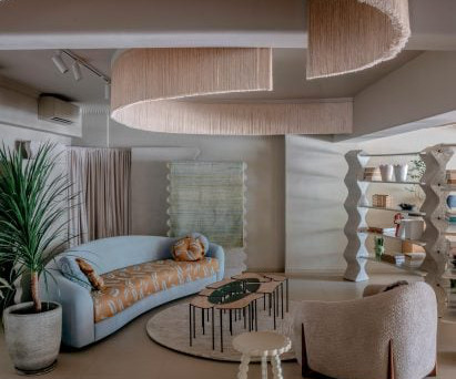
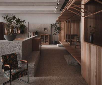
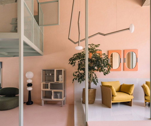
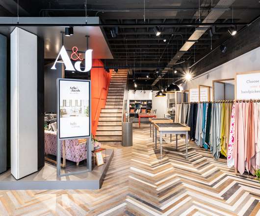
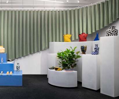
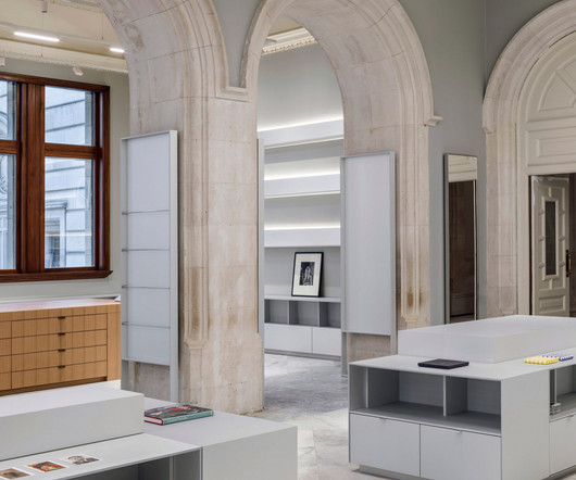
Josmo's Mumbai store is divided into different zones As creative director, Mody designed the retailspace in line with a brand style she describes as "witty, elegant and unapologetically unique". "We Think sculptural forms, earthy textures and just the right amount of drama.
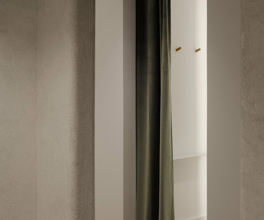
This flows into the men’s space, which manifests in the same aesthetic but with a golden twist on the handmade salt panels. Both interiors showcase a balanced mix of soft shapes and noble materials in vivid shades and textures. The cosy inner-city nook feels like summer and despite its intimate floorspace, feels bright and airy.
If we strategically consider each frame, a retailer can design spaces, activations and areas that resonate deeply with customers on multiple levels, making shopping an emotional experience rather than just a chore. Successful retailspaces are crafted to evoke specific emotions, whether it be excitement, comfort or nostalgia.
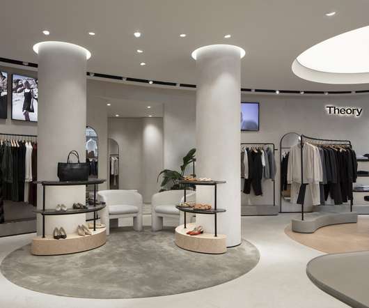
Architecture studio Sybarite have created a retail concept for the new Theory flagship store located on 101-113 Regent Street. This will be part of a ‘connected retailspace’ with Uniqlo, also owned by Fast Retailing. Seamless form and transition exist between the plaster of the walls and the ceilings.
The spatial design revolves around the materiality of the interior, natural texture and artisan craftsmanship, reflecting Lost & Found's philosophy of art and daily life.". Partitions help to give the space a maze-like quality. "We The natural and rough texture of the washed stone walls provides a soft and warm atmosphere.". "The
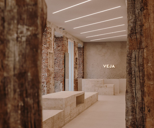
The resulting amalgamation of different colors and textures serves as a background to the white sales surfaces, which are the only 'new' finishes in the store," said Office JDY. The same wood variety forms a counter and storage for a repair shop in the back, which offers to mend Veja products and other shoes. metre) length.
Metal has a broad application of surface effects and metallic tones formed through various methods such as electroplating and coating that bring a wow factor to the visual display. Inviting textural materials, including leather, paper, velvet, and microfiber, helps engage affluent shoppers and show the artisan value of the luxury brand. .
The space was decorated using no colour; only different textures in similar colours were used to highlight the space level," Lialawlab 's chief designer Liya Xing told Dezeen. "It The studio created the Formoral store as a desaturated space with large structures, columns and counters finished in highly textured, grey paint.
The retailspace opens out onto a large terrace, the first Lotte designed outdoor space, with flowing grasses, hidden sanctuaries and sculptures. Shed brought the outside world in by connecting retail and terrace landscapes though the use of natural materials and forms, all reimagined through a luxury lens.
Black and white mosaic tiles form a pattern based on Ciele's apparel at the entrance to the store The 3,000-square-foot (279-square-metre) flagship store was designed by MRDK to be as much a boutique as a community space for runners to meet and socialise.
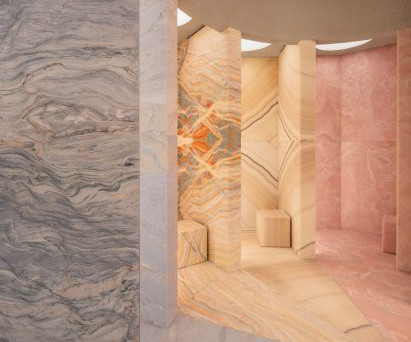
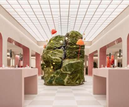
Five vanity rooms are each clad in distinctive coloured onyx or marble A teardrop-shaped column is located in the centre of the store, while boulder-like plinths positioned around the space are used for product displays. The textured display plinths were developed with a bespoke fabricator based in New York, who CNC-carved the forms.
LUO Studio was tasked with working around these existing architectural elements to create an adaptable retailspace that could also host events and exhibitions. The studio, headed by architect Luo Yujie, recognised that installing a conventional suspended ceiling to conceal the pipework would have created a cramped, oppressive space.
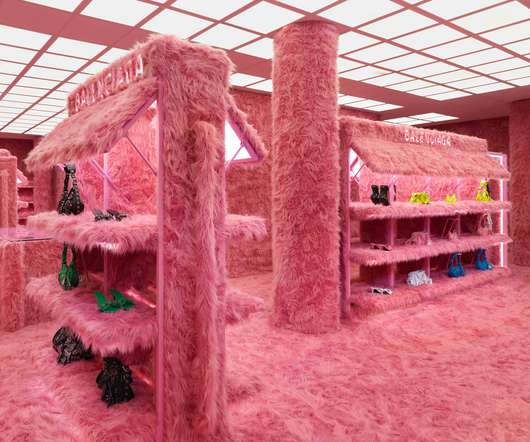
Below are 10 unusual retailspaces recently covered on Dezeen: Photo courtesy of Balenciaga. Brooklyn-based Ringo Studio designed this retailspace in New York City for fitness brand Bala as a pastel-coloured "playground" containing giant replicas of its products. Architecture, which created the space.
The immersive luxury retailing triad Personalised experiences, interactive technology, and multi-sensory environments are three essential pillars that form the foundation of modern high-end shopping experiences. Instead, it focuses on creating memorable, interactive encounters that deeply resonate with discerning consumers.
The 80-square-metre retailspace belongs to Chinese design brand Jianze and forms part of an emerging cultural district in the city's Liangzhe New Town. Built-in cabinets and shelving made from pale birch wood add tone and texture to the space.
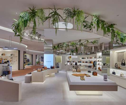
All of the retailspaces are organised around the atrium, which doubles up as a green belt to provide tranquil views of greenery and water from every vantage point. The second floor, housing high-end womenswear, is a neutral gallery-like space with a subdued tonal palette. The platforms are held up by skinny columns.
A display unit wrapped in burgundy-coloured leather forms the centrepiece of this apartment-style showroom in Milan , designed by local firm Eligo Studio for Italian winemaker Masciarelli Tenute Agricole. We look to avoid cliches and fashions and instead create a timeless aesthetic."
Above: the exterior of the store is covered in a textured faux stone. The brand's concrete requirement for this space design was a modern cave," said FOG Architecture. "We The interior was divided and zoned into a collection of small sections each with its own functions, housing retailspace, exhibition space and installation areas.
With health and wellbeing still high on the agenda, Carson said materials that provide an authentic natural look will appeal to the senses and create a comforting and relaxing environment for retailers. Karndean flooring has a durable, waterproof surface that Carson said can stand up to tough retail settings with minimal maintenance.
Located in the Capitol Hill neighbourhood and designed by Glossier's in-house team, the 6,200-square-foot (576-square-metre) retailspace is four times larger than the pop-up and marks the brand's largest physical store to date. "As A communal seating area is designed to look like a terraced landscape.
"The general purpose is to create a contemporary element that, when opened, would bring back some lost time of ancient forms of construction, a slow passing of time, an earthy place. Founded by André Pepato and Mariana Schmidt, MNMA has used a similarly pared-back aesthetic for a number of spaces in São Paulo. it feels like 'home'."
Pop-up retail comes in various forms, each tailored to meet specific brand objectives and consumer needs. The stand-alone pop-up, often taking the form of a boutique on a high street, offers brands the opportunity to create a fully immersive brand environment.
To balance the dark colours and textures of the flooring the studio has inserted pops of colour using light blue tiles on the changing room pods and blue and green counter surfaces. Angular green drapes attached to a steel rack on the white ceiling and wrap around the space to form an adjustable divider.
The Miss Circle flagship in occupies a long, narrow space designed by JUJU Studio The space has a long, narrow footprint, so studio founder Jing Ju devised a variety of display techniques for the brand's womenswear garments.
Born out of a desire for self-expression, escapism and aspiration these values are as relevant today as they’ve always been and formed a crucial insight for Counterfeit Studio as a base for its creative response. “it was clear from the earliest of brie?ng Texture and pattern come from rough Stucco surfaces to ofset the clean lines of ?xtures
The small room uses a subtle blend of material textures and turquoise tones to create a calming space with a premium yet technical feel. Applying neuroscience to interior spaces. The best designers consciously and masterfully use forms and materials to elicit feelings and emotions. 2 Banaei, M.,
The retailspace is housed in a building in the centre of Madrid, which has functioned as a shop, a restaurant and a bank office since its construction around the turn of the 20th century.
Above: its retailspace features marble counters. The service offer is premium and luxury, and the spaces that encapsulate it were designed to echo that at every touchpoint," Kingston Lafferty Design founder Roisin Lafferty told Dezeen. "We Top image: the Fitzgerald Private Clinic has a marble-clad archway.
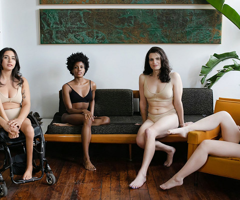
An estimated one in four Americans has some form of disability. For our texture-based products, we look to minimise any of the clothing features that would create a cognitive overload. Another huge step in the right direction would be to make retailspaces more accessible to all customers.
On the other side, the shadows of surrounding display panels are cast onto the products under focus lighting, forming a joyful fusion. The patterns on the center bench are derived from traditional Korean patterns, which are recreated by artists and presented with a metallic texture, achieving an intersection of tradition and modernity.
Alex Cochrane Architects overhauled the National Portrait Gallery's shops Alex Cochrane Architects worked closely with the lead studios to create a main shop next to the museum's new entrance, and two further shops that service temporary exhibition spaces, that each "brought together the monumental and the intimate".
When visitors form an emotional connection with your brand, long-term loyalty follows suit. The design of the mtl cafe adds to the engaging retail experience. The store is set in a two-storey retailspace with a floor area of 40 square metres on the first level and 200 square metres on the second level. Images: Dezeen.
Providing guests and residents eclectic dining and shopping experiences, a range of F&B options – including a rooftop bar and restaurant, lobby lounge café, sports bar, and all-day dining restaurant – will be complemented by 2,800 square meters of retailspace hosting a variety of international brands.
It is how we intentionally design spaces to create mood and connection. Natural shapes and forms This refers to the natural shapes and forms occurring in the natural environment that are recreated in built environments. Here are some examples of retailspaces that have applied biophilic design: Aesop Chicago, Illinois, U.S.A.
The impact of a company’s space on a client, particularly on a first visit, cannot be understated. In seconds, a client—even one who is occupied and not necessarily, purposefully observant at the time—can form an opinion of the company’s brand image. The same principle applies for using textured industrial design elements.
Sometimes all it takes to make a project more inviting is a few natural elements, like real wood , that add a little texture and color. The principles of biophilia can help to explain the growing demand for interior designers to include natural elements into modern spaces. Modern Wood Wall Paneling Design Ideas.
Retail design concepts have come a long way from simply putting one’s wares on display with the goal of getting people to buy. While that remains the bottom line of all retail design, the retail design concepts of today focus on forming a connection between a brand and the consumer.
This is because ingredients such as lighting and visual merchandising each have a crucial role to play in attracting customers to a retailspace and persuading them to make a purchase. Imagine the immensity of the impact of a fully developed, well-wrought commercial retail interior design with all of the finest secret ingredients.
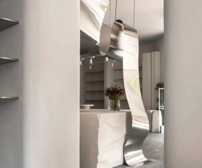
Custom stone furnituremaker Form(LA) has opened the doors of its first flagship store in Los Angeles specifically a pivoting marble door punctuated by nine porthole windows. Form(LA) has opened its first flagship store. The post Form(LA) hides stone furniture showroom behind marble pivot door appeared first on Dezeen.
The Milan -based studio transformed the retailspace into a calm store for Estil.io , which was consistent with the brand's identity. Tones of warm white were chosen as the project's primary hues, and the emphasis was turned to the diversity and blend of various material textures."
We organize all of the trending information in your field so you don't have to. Join 29,000+ users and stay up to date on the latest articles your peers are reading.
You know about us, now we want to get to know you!
Let's personalize your content
Let's get even more personalized
We recognize your account from another site in our network, please click 'Send Email' below to continue with verifying your account and setting a password.


Let's personalize your content