This site uses cookies to improve your experience. To help us insure we adhere to various privacy regulations, please select your country/region of residence. If you do not select a country, we will assume you are from the United States. Select your Cookie Settings or view our Privacy Policy and Terms of Use.
Cookie Settings
Cookies and similar technologies are used on this website for proper function of the website, for tracking performance analytics and for marketing purposes. We and some of our third-party providers may use cookie data for various purposes. Please review the cookie settings below and choose your preference.
Used for the proper function of the website
Used for monitoring website traffic and interactions
Cookie Settings
Cookies and similar technologies are used on this website for proper function of the website, for tracking performance analytics and for marketing purposes. We and some of our third-party providers may use cookie data for various purposes. Please review the cookie settings below and choose your preference.
Strictly Necessary: Used for the proper function of the website
Performance/Analytics: Used for monitoring website traffic and interactions
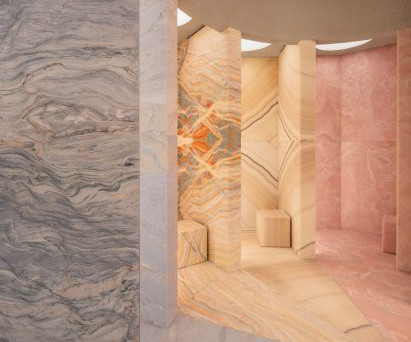
The shop is set within a single asymmetric room "We avoided altering the stones' natural patina or signs of previous use, as these details add to their character and historical significance," said studio co-founder Benjamín Iborra. "No metre-high room using a small crane. No paint or surface treatments were applied.
Located on Fitzroy’s Gertrude St, the location has been transformed from a barber shop untouched for 60 years. The candy poles are wrapped in warm leather sheaths with striped stitching, and the central marble counter acts as a focalpoint, surrounded by profiled timber cladding, textured paintwork, and softened with brushed metal touches.
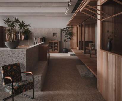
The spatial design revolves around the materiality of the interior, natural texture and artisan craftsmanship, reflecting Lost & Found's philosophy of art and daily life.". The shop is divided by partition walls of different heights. The natural and rough texture of the washed stone walls provides a soft and warm atmosphere.".
As such, the shop is navigated through a series of shoppable layers that are continually uncovered as the customer moves around the environment. Regent Street is an inviting and cohesive backdrop navigated in an organic circular motion through sustainable, muted and textured tone and materiality ”.
Each technique compliments the merchandise displayed in the store windows adding focalpoints for window shoppers. . Excellent for outdoor displays as heat resistant and has a high melting point. Visual merchandising concepts aim to tell a story of your shop, brand, or product. Example 3: Display Pillars .
Both interiors showcase a balanced mix of soft shapes and noble materials in vivid shades and textures. The Australian fashion retailer is ‘back on Cue’ with its new store at the Gold Coast’s premier retail hub, Pacific Fair shopping centre. the feature separating the focalpoint feature room.
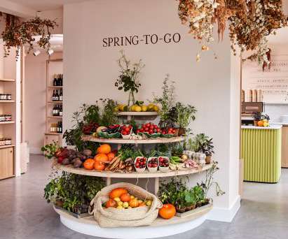
Located in London's Notting Hill, Spring-To-Go is a shop where customers can buy seasonal produce and order restaurant-quality meals for home delivery. The interior is deliberately pared-back to allow the fresh food that's for sale to become the focalpoint. It seemed a natural progression to open the shop," said Gyngell.
Grand steel and micro-cement structures, celestial lighting and symmetrical layouts add a sense of ceremony to the shopping experience within this clothing boutique in Hangzhou , China by Liang Architecture Studio. Simplistic, clear structures and pure textures together express the spatial aesthetics.".
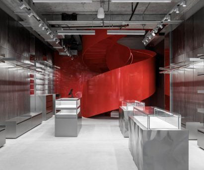
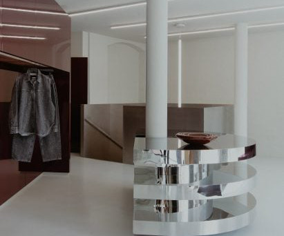
The store's focalpoint is a red lacquered-metal spiral staircase The helical lacquered-metal form has solid balustrades and steps with a diamond-plate texture for added grip. It leads up to a second level where another red wall with floating shelves is used for product displays.
Housing eight dedicated shop fits from brands such as Skims , Agent Provocateur, La Perla and Olivia Von Halle. Over recent years, the way that our customers shop for their intimate investment pieces has changed, with lingerie & lounge becoming just as important of a building block as any other wardrobe element.
The key design components “Live Artwork” and “Resident In” combine with the unique cultural quality of Xintiandi to provide a special shopping experience for the customers. It is a visual focalpoint and a connector of the whole space, to create a smooth and seamless transition going from one zone or style to the next.
The textured display plinths were developed with a bespoke fabricator based in New York, who CNC-carved the forms. The studio incorporated various other materials into the scheme such as textured sprayed plaster on the walls, Romano travertine for the floor, and champagne-coloured anodised aluminium for the display boxes.
With its high-shine burgundy lacquer finish, it provides a focalpoint in the corner of the space. Allgayer also played with transparency, texture and reflection, with materials including granite and glass. The space needs to be neutral because the collection is going to change season to season.
Biophilic Design Biophilic design has become a focalpoint for builders and architects, such as maximizing the natural lighting and optimal air quality. Incorporating elements from the outdoors give this trend an easy way for designers to utilize organic textures made from materials like wood. Less square footage too.
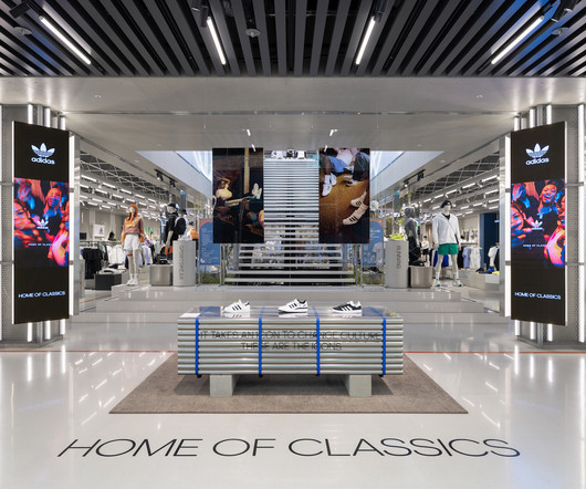
Featuring the “Home of Sport” concept, adidas has opened its first Asia Pacific flagship store in the unique and bustling shopping district Myeongdong, a must-visit spot in South Korea. Meanwhile, the City Shop and Seoul Lab, which were co-created with the adidas retail link team, offer services exclusive in the city flagship.
As competition grew, brands used design elements—like colors, textures, and logos—to attract attention on store shelves. Direct their attention to key product benefits, contrast gradients, and strategic focalpoints. This sensory experience can make customers feel more connected to your brand and choose you over competitors.
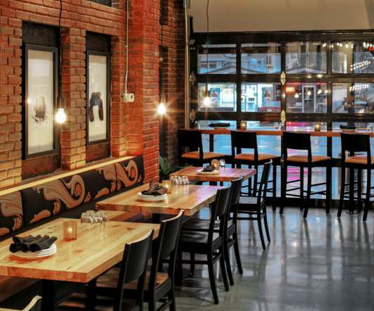
The texture and finish of the bar is a reference to the front doors of traditional Copenhagen homes, the studio says. The inspiration for the restaurant, the studio says, is Chef Kelly’s native Puglia and as such aims to recreate the archetypal Italian courtyard through materials and textures.
Chunky lettering, textures and 3-D features – physical and digital – are appearing across retail environments, proudly taking up space. Expect striking textures, innovative wall graphics, tangible textiles and leaning boards. Overlap textures and colors to grab attention. Planar Luminate Ultra Series Models come in 1.5-
Sometimes all it takes to make a project more inviting is a few natural elements, like real wood , that add a little texture and color. Natural materials like real wood and stone are also being heavily used to add warmth, color and texture. It’s sure to be a focalpoint that patrons will remember!
From the walls to the tables, take a look at these 11 design trends that can be incorporated into your unique restaurant , coffee shop , and bistro interiors. So, in this case, the wood is used as an accent panel, which complements the brick and creates some visual texture and diversity in the room. Wall Paneling.
With serenity and domesticity in mind, it fits the Aesop aesthetic of “monochromatic, multi-textural”, with warm brass and copper, and is elegantly divided into two areas. IRW: Sustainability is a big focalpoint for all retailers these days. Another example is Aesop Parnas Mall.
Where the transaction was once the sole focalpoint of retail design, modern shopfitters and designers take the entire shopping experience into consideration: Someone glimpses a shop window and enters the shop, then browses and samples or tries on the merchandise, eventually making it to the counter and walking out with a purchase.
One way to extend their shopping time is to place speed bumps throughout the layout, or “visual breathing spaces” that give them a chance to process what they have just browsed. Also pay extra attention to shadows that may be cast when lighting products as this can emphasise textures. Love at first sight.
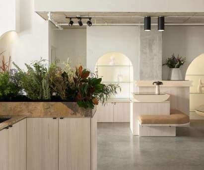
A floristry counter brimming over with flowers and foliage sits at the centre of this Vancouver lifestyle shop , which has been designed by studio Ste Marie. This verdant setting ended up being a key point of inspiration for Ste Marie 's design of the store's interior. At the centre of the Cadine store is a floristry counter.
The past year has seen a growing trend for over-the-top shop interiors, from stores containing surreal sculptures and installations to those masquerading as something else entirely. A large Klein-blue rock sculpture covered in non-reflective paint provides the focalpoint and adds to the interior's dreamlike feel. Architecture.
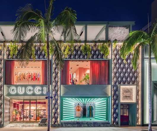
Situated on the third floor terrace above the Gucci store, visitors can dine at eye level with the tops of the palm trees that line the famous shopping strip. Inside the seating area features high-backed red velvet upholstered sofas set into textured gold walls. My shop has become a bit of an extension of my home.
We organize all of the trending information in your field so you don't have to. Join 29,000+ users and stay up to date on the latest articles your peers are reading.
You know about us, now we want to get to know you!
Let's personalize your content
Let's get even more personalized
We recognize your account from another site in our network, please click 'Send Email' below to continue with verifying your account and setting a password.


Let's personalize your content