This site uses cookies to improve your experience. To help us insure we adhere to various privacy regulations, please select your country/region of residence. If you do not select a country, we will assume you are from the United States. Select your Cookie Settings or view our Privacy Policy and Terms of Use.
Cookie Settings
Cookies and similar technologies are used on this website for proper function of the website, for tracking performance analytics and for marketing purposes. We and some of our third-party providers may use cookie data for various purposes. Please review the cookie settings below and choose your preference.
Used for the proper function of the website
Used for monitoring website traffic and interactions
Cookie Settings
Cookies and similar technologies are used on this website for proper function of the website, for tracking performance analytics and for marketing purposes. We and some of our third-party providers may use cookie data for various purposes. Please review the cookie settings below and choose your preference.
Strictly Necessary: Used for the proper function of the website
Performance/Analytics: Used for monitoring website traffic and interactions
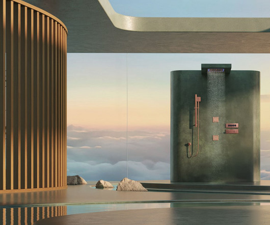
Jaquar Group- A global leader in complete bathroom and lighting solutions. Its range of brands Jaquar, Artize, and Essco cater to luxury, premium, and value segments, offering solutions that span faucets, sanitary ware, lighting, and wellness.
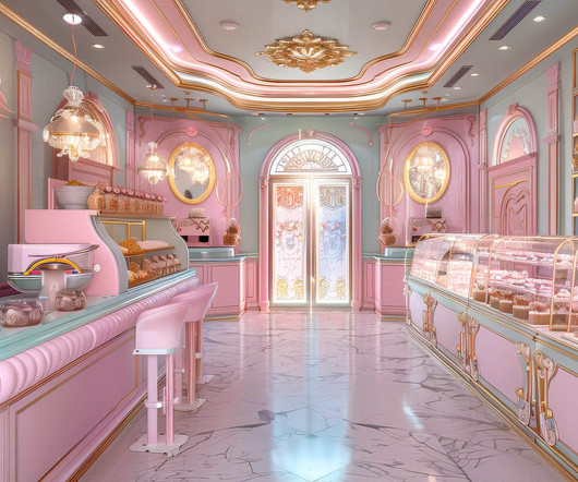
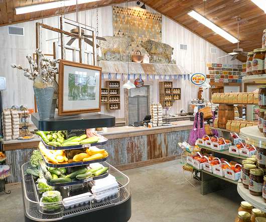
Use of Relaxing Colors and Materials Soft Natural tones like green, light blue, beige, or gray are commonly associated with tranquility and calmness. These colors evoke nature and help soothe the minds of shoppers. The use of indirect lights, floor lamps, or even candles (where safe) helps create a calming atmosphere.
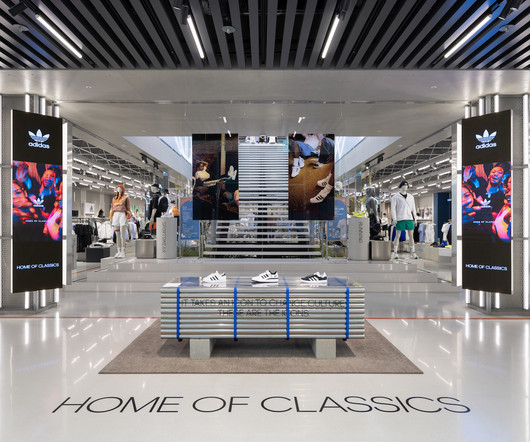
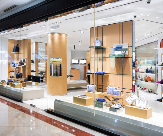
Design aspects: The right colors and creative designs can make products stand out on shelves, helping differentiate items in a crowded marketplace. You can achieve this by placing the most important or high-margin products at eye level, using larger items to anchor the display or integrating distinctive lighting to highlight these items.
However, the real purpose of this discipline isn’t merely to create beautiful environments but to design strategic experiences where every element—from lighting to product placement—contributes to the ultimate goal. This is something that a visionary Retail Designer knows how to maximize.
Despite their robustness, these materials possess a level of flexibility that allows them to bend at corners, creating flowing spaces that appear more comfortable and elegant. Among the notable features of these new materials is their durability and ability to withstand various weather conditions such as moisture and heat.
Will you tell it with color? Eye movement – Does the eye easily flow throughout the entire display? Signage – The story doesn’t end with just shapes and colors. Lighting – Probably the most essential element of a display, lighting is a highlighter and mood enhancer. Is it through humor? Sophistication?
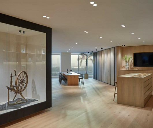
Lighting, for example, can have a significant impact on the look and feel of a retail environment. The use of natural light, or artificial lighting to highlight key product displays, can create a welcoming atmosphere. Customers should feel comfortable and at ease in a retail environment.
The concise and clean layers with dynamic lighting effects emerge from the lively streets as a pure and dazzling scenery of Myeongdong. Viewed from different angles, the reflected blurred color blocks enrich the clean display shelves and connect to the outdoors in a subtle way.
For example: When developing product displays, incorporate your logo, brand colors, and specific language to connect your products with your brand. may not provide an opportunity to incorporate your logo, but you can still utilize brand colors. Manage the display’s flow. Use a variety of trade show exhibit lighting.
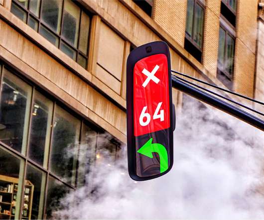
The colored circles that define a traditional traffic light work hard to keep roads safe. For nearly 100 years they have directed the flow of traffic around the world, managing the increasing popularity of cars and preventing potential mishaps whilst us humans get from place to place. for slowing down, and an arrow to go.
Swooping shaped lighting fixtures are bringing a soft edge to retail and restaurant interiors this year, creating balance in relation to angular and digital features. When it comes to colors, organic shades and pastels abound. Milky glass is becoming a mainstay, allowing light to glow through the glass. LS Lighting Corp.
Design factors that trigger the release of dopamine can be as simple as including color-changing lights, for instance. The little jolt one gets when they see something bright and colorful is connected to the release of dopamine. In fact, color is critical and should always be considered for any space.
Material selection was key: using brass in tabletop details, light fixtures and hardware, brings warmth to the daytime space, but provides an elegant twinkle in the evenings. For morning coffee service, traffic flows directly along a colorful 50-foot mural wall. Circulation paths also blur the lines between night and day.
Effective messaging hierarchy means messaging flows organically across a trade show booth. Pleasing colors. Colors have a subconscious effect on people. Research from Oxford University found that color changes how we perceive flavor. The study had people drink the same hot chocolate from different colored cups.
The office-as-playground trend, marked by whimsical features like indoor slides, themed meeting rooms, and candy-colored hammocks suspended from the ceiling, became the calling card of Silicon Valley start-up culture and tech companies. Other-directed play is social in nature, while Light-hearted play refers to “seeing life as a game.”
Simple pieces of artwork can easily add a little flair and color to the environment. To showcase the artwork, lighting plays a major role. Lighting is used in all restaurants and acts as a design feature that can accent the product and enhance an individual’s dining experience. Bamboo Sushi in Portland, OR 2.
In this environment, visitors can walk through waist-high “gardens” that react to touch by changing color in real-time. Guests can stroll though large exhibition spaces where floors and walls are bathed in beautiful digital imagery, including water that seems to flow over rocky outcrops.
Your theme may use cartoons and bright colors to catch kids’ attention and evoke emotions of excitement. For Easter, you can use a floor display decorated with colorful cardboard eggs, toy rabbits, wooden crates and display boxes. Use vibrant colors for that visual appeal. A good theme is simple yet effective.
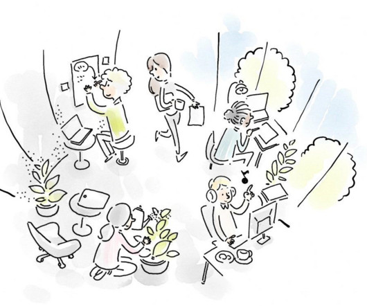
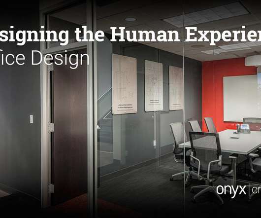
By curating more holistic environments that bring together space planning, architecture, lighting, acoustics, materials, texture and even objects, the design of the workplace can feel like a favorite restaurant or hotel that you want to return to again and again.
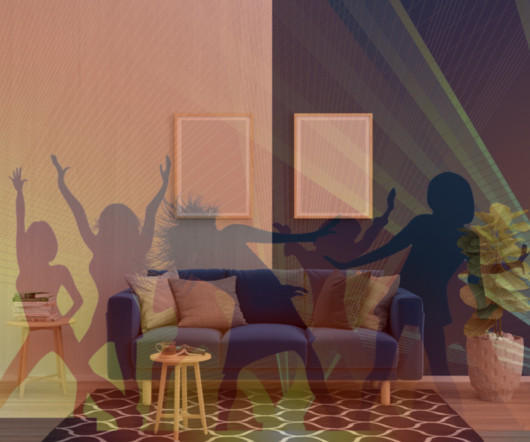
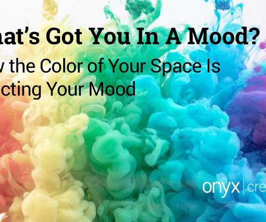
HOW THE COLOR OF YOUR SPACE IS AFFECTING YOUR MOOD When you get that urge for change and you want to redesign your room, choosing a color should be the first thing to consider. Your mood can easily be shifted based on the colors that surround you. Warm colors, those in the red and yellow families, have a stimulating effect.
Lots of natural light and good lighting: Bring in as much natural light as possible to make the space bright and inviting. And let’s remember proper lighting for when the sun goes down. Smooth traffic flow : Keep the flow of movement in mind when designing the layout.
Things like proportion, scale, acoustics, lighting, colors, and layout affect how people feel, behave, and interact in a space. Things like proportion, scale, acoustics, lighting, colors, and layout affect how people feel, behave, and interact in a space. The built environment shapes behaviors. Is that your puppy?
Manufacturers should ensure that the display elements, including colors, logos, and typography, adhere to the established brand guidelines. Strategic placement can optimize customer flow and increase the chances of making a purchase. This consistent branding across all stores helped produce repeat customers.
Let Your Imagination Run Free” with these colorful, high-quality pens is another example of combining strong visuals with aspirational messaging to engage shoppers — in this case, to literally enjoy a tactile, “hands-on” experience with the product by drawing or doodling with the pens and paper provided here.
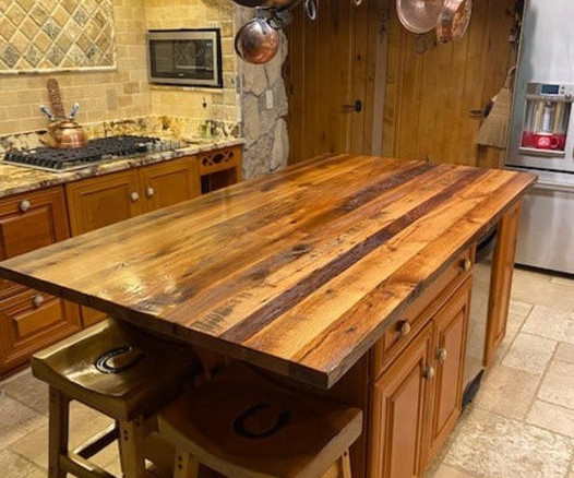
Contrasting Colors Define The Space Incorporating an island adds some needed separation to any kitchen and defines the working space from the communal areas. Using color ranges and contrasting materials creates a space that is not only functional but has visual appeal.
Camping might be a chance to hang out in nature but some extra lights, comfortable chairs and a decent speaker never go amiss. There’s also a compass and a 4-mode LED ultra-bright flood light with up to 40 hours of life. One full canister provides 25 seconds of high-pressure water flow or 40 seconds of standard pressure.
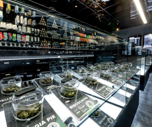
By adopting clean lines, neutral color schemes, and uncluttered spaces, dispensaries can create a calming and sophisticated ambiance. Consideration should be given to customer flow, product accessibility, and privacy. Customizable Lighting: Lighting plays a vital role in setting the mood and highlighting products.
Using a uniquely flexible and ultra-thin concrete, designer craftsman Neil Aronowitz has created flowing pieces of furniture that fold in on themselves like this console table. Concrete has a heavy and very dense feeling to it, and I was trying to create something very light. The surface is then sealed to prevent it from staining.
A space’s impact on the senses should be considered as early as possible in the design phase, and inform decisions from the acoustic strategy, right through to lighting choices. These provisions can be small, like specifying dimmable lights in meeting rooms and quiet spaces. Making sense.
The renovation and expansion project aimed to encapsulate the essence of Scandinavian design, characterised by natural materials, subtle textures, and an abundance of natural light. The neutral color palette and minimalist detailing emphasize the logic and beauty of the wood, creating a space that exudes clarity, rhythm, and repetition.
Open Floor Plan Consider an open floor plan that provides ample space and allows for a more fluid customer flow. Digital signage, interactive displays, and smart lighting can be altered easily to match specific themes or events. Neutral Color Schemes Choose a neutral color scheme for walls, floors, and fixtures.
Trends in office design have ebbed and flowed for hundreds of years, as have their purpose. From there, the company looks for buildings with “an abundance of natural light because that’s definitely a core value that we hold,” said Köerting. The lighting is…at the right levels. Classic Design Can Boost Sustainability .
Exhibits stand out when the design includes interesting textures, colors, and angles. Creative Lighting. Light boxes, LED screens and projection mapping are popular and effective options today. Lighting and motion are big attention grabbers. With regards to movement, a TV screen with video highlights is a good start.
However, the real purpose of this discipline isnt merely to create beautiful environments but to design strategic experiences where every elementfrom lighting to product placementcontributes to the ultimate goal. This is something that a visionary Retail Designer knows how to maximize.
The common thread between these green projects is the goal of boosting natural light and ventilation through prioritization of outdoor and communal spaces—such as community garden terraces with charming string lights and individual balconies in each unit. Our goal lies in establishing a true indoor-outdoor experience.
Our materials for outdoor products are long-lasting, strong, and create the perfect canvas for even the most colorful graphics. And your business lights up social media. The mesh design allows the wind to flow through the banner without tearing the material or disrupting your message. Mesh magic.
Biophilia As study after study shows that exposure to natural elements has positive influence on our health and wellbeing, more and more environments are beginning to integrate greenery, natural and nature-inspired materials and use of color palettes that reminisce of outdoor elements.
Artifact: Focal lines blend into soft, expanding colors in this pattern, which originates from an oil painting. The four-color palette offering, ranging from subtle pastel to warm and cool neutrals, evokes the feeling of a Modernist landscape. ? The eight-color palette of misty, spa colors acts to inspire inner.
For more task-oriented quiet zones, different lighting options should be incorporated. This allows the employee control over the level of light intensity. Layering in natural light also encourages more openness and desire to be social. Nature is inherently rejuvenating and restorative to an individual’s wellbeing.
You should also consider incorporating your brand’s logo, color scheme, and messaging seamlessly into your coveted booth design. Apple has always had a recognizable logo, color scheme, and stylish approach to branding. Lighting Pay attention to the lighting around your booth.
This helps create a pleasing atmosphere and a sense of flow. Use minimal, proportional, and functional furniture pieces with small pops of accent colors like blues and greens to appeal to a wider range of potential renters or potential buyers. Don’t use heavy or dark paint, busy wallpaper on the walls, or poor lighting.
We organize all of the trending information in your field so you don't have to. Join 29,000+ users and stay up to date on the latest articles your peers are reading.
You know about us, now we want to get to know you!
Let's personalize your content
Let's get even more personalized
We recognize your account from another site in our network, please click 'Send Email' below to continue with verifying your account and setting a password.


Let's personalize your content