Remove Color Remove Contrast Remove Planning Remove Space
article thumbnail

Color Your Space: More Than Primary

Onyx

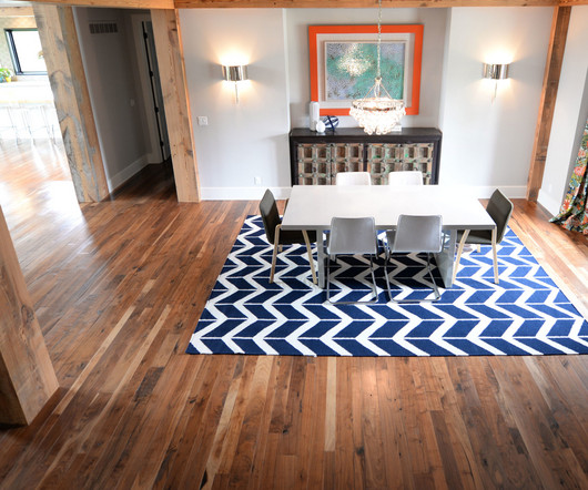
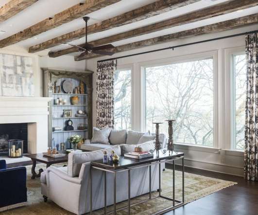
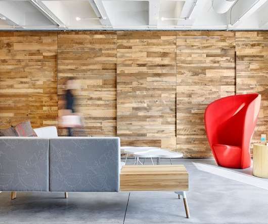
Adding color to a room is one of the quickest and easiest ways to change the look of a space, but is choosing a color for your space really that big of a deal? Color is so much more than the color itself. Color plays an essential role in our lives. Color begins with a general palette.

Color 75
article thumbnail

Harnessing Pallet Skirts for Club Store Success

Creative Displays Now

These reasons prove why 73% of consumers would still buy items in brick-and-mortar retail spaces. Cardboard pallet skirts are customizable, allowing you to tailor the colors, images and messaging to your brand. When choosing colors for your custom pallet skirt, remember the concept of color psychology.

Color 98
Insiders

Sign Up for our Newsletter

This site is protected by reCAPTCHA and the Google Privacy Policy and Terms of Service apply.

Trending Sources

article thumbnail

Best Practices for Setting Up Retail Displays

Creative Displays Now

Setting up displays in stores is an art form combining creativity and strategic planning. High-ticket products are often the center of attention in a store’s layout plans. Think about the month, season, upcoming holidays, special events in the store or even local happenings as you plan the display stand’s layout.

Display 78
article thumbnail

The Hyundai, Seoul | 51st International Design Competition Winner

Retail Design Institute

A skylight extends through the building core and bathes the space in natural light. The second floor offers a gallery-like space to meander and explore women’s fashion. The lighting plan, combined with the subdued color palette, underscore the sophisticated atmosphere.

Design 82
article thumbnail

Common Retail Signage Mistakes to Avoid

Creative Displays Now

If you have to save space on a smaller sign, prioritize the lettering. Lettering Spaced Close Together. Your sign will appear cheaply made if the spacing is uneven or if the letters are too close together. The worst spacing mistake happens when you run out of room to keep drawing neat lettering. Too Much Information.

article thumbnail

FIKA Herbal Goods, Toronto | 51st International Design Competition Winner

Retail Design Institute

A variety of materials create contrast between different departments – from the luminous marble suggesting freshness in the bakery, charcuterie, cheese and butchery areas — to the warm dark colors used in the wine cellar, wine bar and sushi bar. The lighting plan further contributes to defining each department and store zone.

Design 82
article thumbnail

Want the customer’s eyes on your product? Try removing the ceiling.

Fixture Lab

Sometimes the ceiling in a store is messy, dirty or distracting because there are so many colors going on up there. A lot of the time the ceiling is just painted white (or some other light color) and the net effect is unoffensive…but uninspired. Part of that plan was painting our white ceiling a dark grey color.

Color 52