This site uses cookies to improve your experience. To help us insure we adhere to various privacy regulations, please select your country/region of residence. If you do not select a country, we will assume you are from the United States. Select your Cookie Settings or view our Privacy Policy and Terms of Use.
Cookie Settings
Cookies and similar technologies are used on this website for proper function of the website, for tracking performance analytics and for marketing purposes. We and some of our third-party providers may use cookie data for various purposes. Please review the cookie settings below and choose your preference.
Used for the proper function of the website
Used for monitoring website traffic and interactions
Cookie Settings
Cookies and similar technologies are used on this website for proper function of the website, for tracking performance analytics and for marketing purposes. We and some of our third-party providers may use cookie data for various purposes. Please review the cookie settings below and choose your preference.
Strictly Necessary: Used for the proper function of the website
Performance/Analytics: Used for monitoring website traffic and interactions
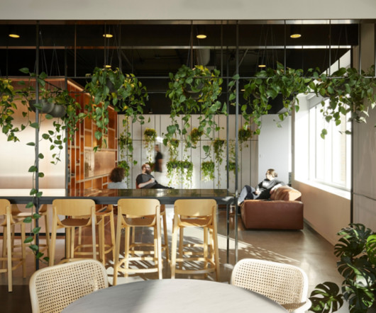
Inside, neoclassical columns in a vibrant orange tone not only serve as visual support for these capsules but also introduce a dynamic contrast with predominant materials like acrylic and stainless steel. These vitrines, surrounded by natural vegetation evoking a contained paradise, elevate the space to an almost museum-like imaginary.
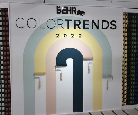
Let’s ring in the new year with a beautiful fresh color option for designers, builders, architects and decorators! COLOR HARMONY. Elmwood’s favorite palette option is formally called “Color Harmony” by Pantone. Since then, it has become the standard language of colors as defined in the Pantone code. CENTER STAGE.
Adding color to a room is one of the quickest and easiest ways to change the look of a space, but is choosing a color for your space really that big of a deal? Color is so much more than the color itself. Color plays an essential role in our lives. Color can influence mood and invoke an emotional response.
Fabric textures can influence the perception of colors, so creative visual merchandising concepts select and combine different fabrics with building a story for retailers. A sense of contrast . The color combination of beige and metallic tones brings masculinity to match the brand’s image. Easy to obtain . Longevity .
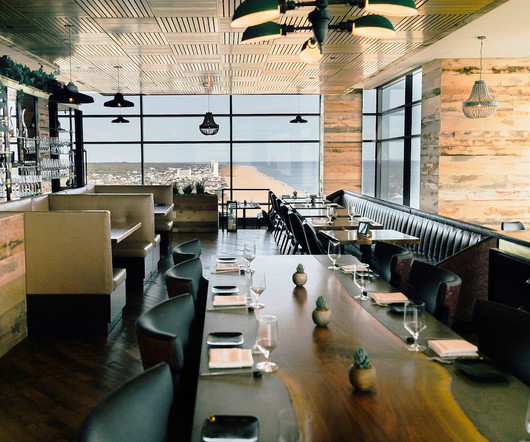
Dressed in bubblegum pink and royal blue, Dijon restaurant in Almaty, Kazakhstan makes color and visual contrast its winning allies. Designed by Almaty-based architectural group and consultancy Lenz / Architects, this French dining venue brings together elements that are soft and rough, raw and sophisticated, industrial and modern.
Design aspects: The right colors and creative designs can make products stand out on shelves, helping differentiate items in a crowded marketplace. Color psychology: Different colors can evoke different emotions and reactions, which may influence buying decisions.
The resulting amalgamation of different colors and textures serves as a background to the white sales surfaces, which are the only 'new' finishes in the store," said Office JDY. metre) length. An adjacent courtyard was also transformed to host outdoor events and activations, using red-hued wood panels, globe-shaped lights and a pergola.
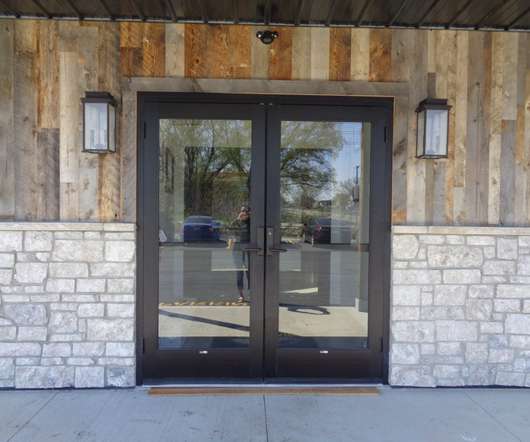
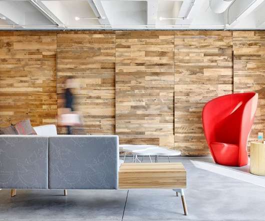
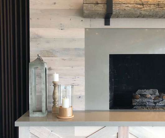
Creating an accent wall or adding some texture or a different color to the wall decor of a room has long been a recommended interior design technique for upping the style in both homes and commercial spaces. . Wood accent walls have helped take this to another level, adding warmth and a rustic look to rooms as well as interest and color.
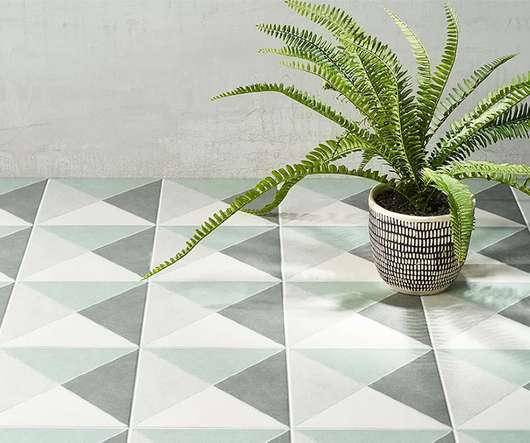
While safe and convenient, the inclination to choose subdued colors or low-key patterns for floors belongs to timid designers. In fact, when used right, floor materials that bring in bold patterns and high contrasts can make an immense difference in the feel and unique character of a space.
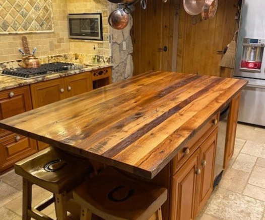
Using lighter colored woods adds warmth and at the same time keeps the room bright. Large Island Tops With Stools Are Inviting for Guests When considering timeless design styles it is important to use classic materials paired with colors that are not too trendy. This stark contrast feels right at home with clean white walls.
Different colors and shapes in packaging can affect people’s perception of a product’s quality, while sustainable packaging may be more attractive to eco-conscious customers. When choosing brand and packaging colors, keep in mind that colors may have different meanings across cultures.
They racked up over 10,000 steps each, while seeing all of the trends, color reports, and new product launches that filled the 10 floors of the Mart. Once again, the line between residential and commercial design has blurred, and a more soft pastel color palette took the forefront. Their design is reminiscent of a popsicle.
Presented in three color and texture combinations, +GLASS is a series of artifacts made through manual and machine processing. The two products blend perfectly, in a synergy of balance between full and empty, allowing you to create infinite composition possibilities, customizable in colors and shapes.
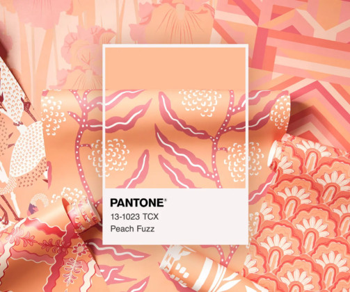
How to Incorporate the 2024 Color of the Year “Peach Fuzz” into Your Custom Packaging Pantone selects an iconic color every year to influence product development and purchasing decisions in multiple industries. Start by considering how “Peach Fuzz” can serve as either a primary or accent color.
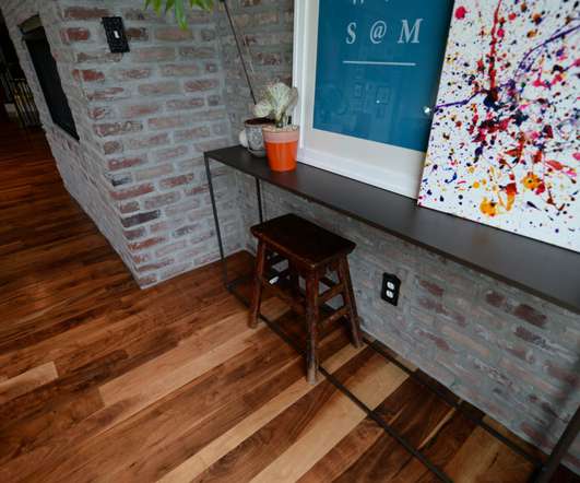
Walnut floors have a sought after color and woodgrain that make them the instant focal point of any design. The Color of Walnut. Walnut has a color that’s unique amongst hardwoods. The heartwood has a very rich, dark (almost purple) color that ranges through many shades of dark brown. Walnut Finishes.
Awkward or Difficult to See Contrast. When choosing the color scheme for your sign, make sure it balances complementary and contrastingcolors to form a visually appealing harmony. The lettering needs to contrast with the background so your customers can read it. Creating contrast differs from clashing colors.
Each decision — colors, textures, fabrics, and finishes — contributes to the larger vision. Designing with a striking color palette draws the eye inward, and incorporating various textures also adds visual contrast and uniqueness to the interiors.
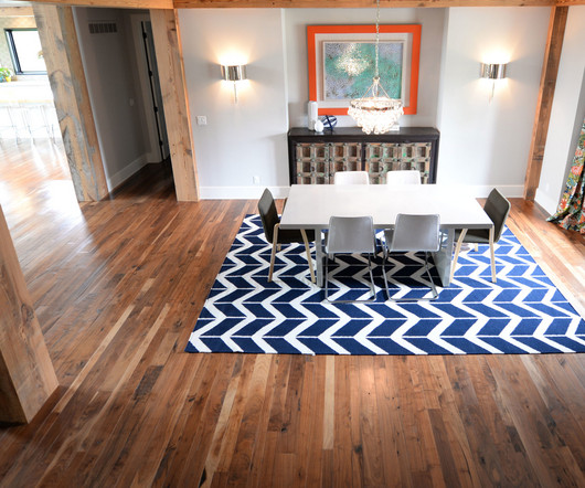
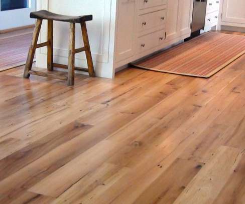
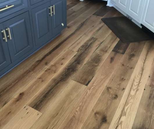
There are many types of wood flooring options that come in a range of different species and color palettes. You can have light wood flooring that has been sanded smooth and left in its natural color, a solid wood floor that’s been allowed to patina, or a dark wood floor that’s been given a stain to enhance its color.
ContrastingColors Define The Space Incorporating an island adds some needed separation to any kitchen and defines the working space from the communal areas. Using color ranges and contrasting materials creates a space that is not only functional but has visual appeal.
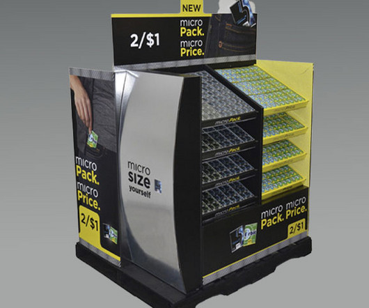
Cardboard pallet skirts are customizable, allowing you to tailor the colors, images and messaging to your brand. Use Bold Colors Whether you highlight your brand colors or reflect the hues of a specific product, bold pallet designs ensure your items stand out. Why Do Pallet Displays Work So Well in Club Stores?
A contrasting touch-sensitive, stainless steel switch connects the two elements which “ represents the human relationship between Earth and space,” says Fernandez. Mexico is a place full of contrast, elements and culture. Because they transmit pure artisan craftsmanship, color and form in the most minimal and seamless way,” she says.
As competition grew, brands used design elements—like colors, textures, and logos—to attract attention on store shelves. Use Neuromarketing Principles in Visual Design Visual cues, color psychology, and sensory elements can subconsciously guide purchasing decisions by shaping moods and perceptions.
Cafe Nuances' latest branch has a bright white facade The one-room shop is fronted by a bright white facade in stark contrast to its vivid-hued interior.
No matter what style, color or species of wood you choose, it’s sure to have a positive impact on your interior design. Versatile Color Palette. White oak pairs well with both warm and cool tones ranging from yellow to blue and also works well with many of today’s popular colors such as grey and taupe. Natural Color.
Implementing inclusive design requires involving diverse user groups in the design process, balancing competing needs, and employing varied design elements like zones, materials, colors, and lighting to accommodate different users. Materials, colors and lighting play crucial roles in inclusive design.
For example, designer deck flooring has become a popular solution that can blend contemporary colors from the interior or exterior features of a home and integrating them with the floor surface outside. Using a combination of vegetation and an element like stone allows for the contrast between hard and soft.
“After many years with Linneys in our design team, there’s a lot of things you learn about working with the pink diamonds – it’s better to set them in rose gold, and you need the contrast of color of the white diamond so you can appreciate the pink hue.” All considerations that have been crafted into the quokka. “It’s
The starting point was to make a funky planter in contrast to the plant,” he explains. “I Adding coloring pigments. The end product is a planter that comes in multiple colors and shapes. The objects are always unique and will be different in shape and color. Add special glue and binding materials.
The lighting plan, combined with the subdued color palette, underscore the sophisticated atmosphere. On the third level, the design team contrasted natural and man-made materials, unfinished ceiling, custom built, vacuum-formed sculptural walls and a simple color palette, to speak directly to featured brands.
When entering a lobby or transition space, considerations should be made to provide clear lines of sight for easy navigation, pops of color for interest, and imagery to reinforce branding and aid in wayfinding. Varied ceiling heights, patterns and pops of color create areas of focus, social cues and engagement. Congregate/Meet/Learn.
Sustainably cut wood tends to have more consistency in color and texture. While reclaimed or mixed-use wood may have wood taken from several species or several areas and contain more variations in tone, color and grain pattern. The color, grain pattern and sizing of the boards are then controlled during the milling process.
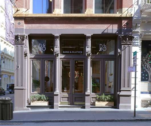
Lastly, we have kept Bang & Olufsen’s strong Scandinavian heritage in mind though the minimalist color palette and lots of natural light.”. An abundance of natural light paired with a minimalist color palette convey the brand’s Scandinavian origins. It plays with contrasts (think pale walls with a dark ceiling), and with shapes.
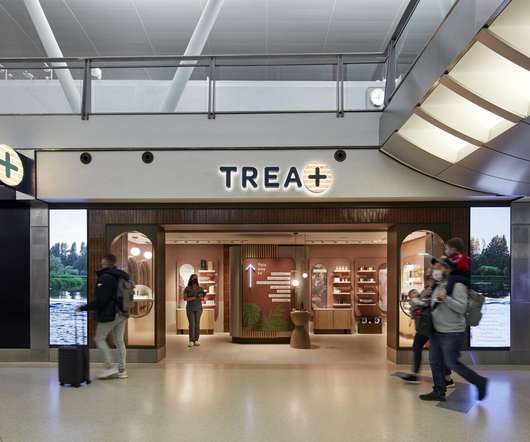
The material palette is layered, textured and warm with the use of tiles, plaster-look wallcoverings, fabrics, and colors like rose beige, brown, and bronze – a beacon of warmth in contrast to surrounding retail. A menu of services placed front-and-center lets customers know at-a-glance what the store is about.
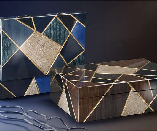
Juxtaposing precious woods of different textures and colors, the collection conceptualizes nature within a dynamic framework. The intention was to transform scenery into a graphic language informed by the company’s mastery of color and its ability to create striking, three-dimensional patterns.
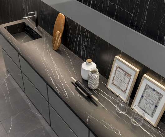
Inspired by marble, Florim creates porcelain surfaces that reflect the variety of color, vein and texture found in the natural material. The look inside depends on its purity, hence marble that can be bluish, grey, green, pink, yellow, or black in color.
The material palette is layered, textured and warm with the use of tiles, plaster-look wallcoverings, fabrics, and colors like rose beige, brown, and bronze – a beacon of warmth in contrast to surrounding retail. A menu of services placed front-and-center lets customers know at-a-glance what the store is about.
Natural wood contains many different undertones , colors, shades, wood grain patterns and markings. Some woods, like hickory , may be wild in their colors and patterns, while others like clear white oak may be more subtle. This kitchen uses solid wood cabinets in a coordinating color that can be found in the flooring.
Using a dark wood , such as walnut, will add contrast and allow the wood grain to show through the finish of the wood paneling. Oak is a classic choice for whitewashing as it absorbs and takes on colors and stains well. Elm is naturally light in color and ranges from light tan to medium-reddish brown.
Today, there are so many great types of wood paneling options and different colors available; some being traditional, others are rustic, and many create very modern looks that are prevalent on magazine covers and coveted by architects and top interior designers worldwide. This logo stands out well against all the dark wood in the hallway.
switchup utilized contrasting architectural elements and color palettes for the Classiq Technologies offices in Tel Aviv, Israel. ClassiQ Technologies offers.
The smooth minimalist curves of the custom-designed reception desk and the overall clean color palette of the spacious reception area give off a professional yet comforting atmosphere. A perfect vibe to encourage first-time visitors to approach the counter for guidance and help. Interested in Giving Your Store Front an Exciting New Look?
A variety of materials create contrast between different departments – from the luminous marble suggesting freshness in the bakery, charcuterie, cheese and butchery areas — to the warm dark colors used in the wine cellar, wine bar and sushi bar. The lighting plan further contributes to defining each department and store zone.
We organize all of the trending information in your field so you don't have to. Join 29,000+ users and stay up to date on the latest articles your peers are reading.
You know about us, now we want to get to know you!
Let's personalize your content
Let's get even more personalized
We recognize your account from another site in our network, please click 'Send Email' below to continue with verifying your account and setting a password.


Let's personalize your content