This site uses cookies to improve your experience. To help us insure we adhere to various privacy regulations, please select your country/region of residence. If you do not select a country, we will assume you are from the United States. Select your Cookie Settings or view our Privacy Policy and Terms of Use.
Cookie Settings
Cookies and similar technologies are used on this website for proper function of the website, for tracking performance analytics and for marketing purposes. We and some of our third-party providers may use cookie data for various purposes. Please review the cookie settings below and choose your preference.
Used for the proper function of the website
Used for monitoring website traffic and interactions
Cookie Settings
Cookies and similar technologies are used on this website for proper function of the website, for tracking performance analytics and for marketing purposes. We and some of our third-party providers may use cookie data for various purposes. Please review the cookie settings below and choose your preference.
Strictly Necessary: Used for the proper function of the website
Performance/Analytics: Used for monitoring website traffic and interactions
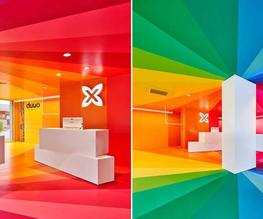
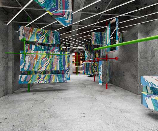
dubbed 'spectrum', the instagramable retail space is so saturated with color that it looks almost unreal. The post a color explosion: studio animal completes rainbow-hued store in barcelona appeared first on designboom | architecture & design magazine.
The post vivid pops of color + shiny pillars form sugawaradaisuke’s store in tokyo for louis vuitton appeared first on designboom | architecture & design magazine. apart from the eye-catching volumes, the dense cylindric metal pillars provide visitors with a feeling of strolling through a vast forest.
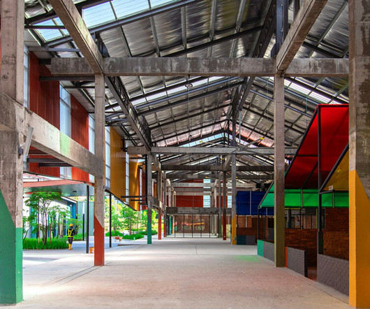
The post colorful roofed units compose TKCA architect’s sama square market village in kuala lumpur appeared first on designboom | architecture & design magazine. tkca architect maximizes the ground plane to create a multi-layered experience of public plazas, markets, and retail spaces.
downlights and indirect lighting shift in color and brightness, enhancing the client journey. The post SESN curates dynamic colored lighting for sensory beauty clinic design in japan appeared first on designboom | architecture & design magazine.
Shaftesbury has announced that popular Danish fashion retailer, Colorful Standard, has opened a permanent flagship space in Seven Dials. Colorful Standard was first introduced to Seven Dials last year, with a pop-up store located on 18 Earlham Street as part of the retailer’s London expansion. Colorful Standard dealt direct.
The post multi-colored plating ornaments manoa vintage clothing store by fathom in hiroshima appeared first on designboom | architecture & design magazine. fathom's design showcases the sustainable cycle of old clothes, appreciating the value of vintage fashion.
The post alternating patterns and splashes of color energize retail interior by ROOI in shanghai appeared first on designboom | architecture & design magazine. The design presents a contemporary interior with striking spatial elements that draw the attention of passersby.
The post pixelated gaming visuals turn into bold colored blocks within x+living’s top toy flagship store appeared first on designboom | architecture & design magazine. top toys first global flagship store in shanghai, designed by x+living, feels like entering a retro video game.
The post snøhetta expands moniker’s playful and colorful universe in oslo appeared first on designboom | architecture & design magazine. snøhetta has designed a playful brand and interior concept for norwegian house of fashion brands, moniker.
the diamond-shaped bricks expand the volume of the interior and visually enhance the colorful SHANG XIA products. The post kengo kuma designs its SHANG XIA interior in beijing with a constellation of glass bricks appeared first on designboom | architecture & design magazine.
geometric elements and perforated surfaces create an engaging interplay of light and color. The post red cantilevered volumes outline one house design’s shanghai techstorm exhibition hall appeared first on designboom | architecture & design magazine.
the expansion realized by halleroed celebrates acne studios' signature brand colors, materials, and curated furnishings. The post acne studios’ signature flamed pink granite envelops beijing sanlitun flagship store appeared first on designboom | architecture & design magazine.
In the bustling and vibrant world of design, where tradition meets innovation, Mooque Sarunphon Boonto‘s design ethos, deeply ingrained with the nuances of storytelling, visual allure, […] The post Influenced by storytelling, visual elements, and harmonious color combinations appeared first on DesignWanted.
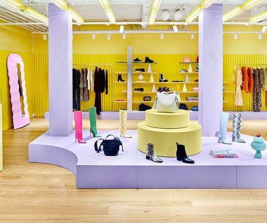
studio animal utilized geometry and color to meet the requirements of the client while providing a memorable experience for shoppers. The post stepped yellow walls shape a clothing store in malaga designed by studio animal appeared first on designboom | architecture & design magazine.
Stainless steel is a remarkably powerful material, well known for its exceptional mechanical performances and surface properties, which make it […] The post Using light and ceramic structures to bring colors onto metallic surfaces appeared first on DesignWanted.
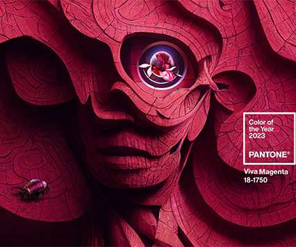
has announced “Viva Magenta” as its 2023 Color of the Year. The color consultancy says the crimson red tone presents a balance between warm and cool, dubbing it “an unconventional shade for an unconventional time.”. “In Because reds are advancing colors, they draw the eye and muscle out the colors surrounding them.
So, here is something new and worthy of attention in the world of interior design: The 2023 Pantone color of the year […]. The post 2023 Pantone Color of the Year is Bold and Energizing appeared first on Mindful Design Consulting.
the showroom takes its cues from rajasthan's distinctive ancestral architecture of recurring stepwells and arches, and color palette of pink and terracotta. The post roar designs captivating display of recurring stairs for jaipur rugs showroom in dubai appeared first on designboom | architecture & design magazine.
The post Pigmenti is Lea Ceramiche’s new colorful tactile collection appeared first on DesignWanted. Ferruccio Laviani is a designer with quite a radical attitude, he is not afraid of daring and pushing the limits when it comes to products: the […].
With 3d product renderings, you can virtually test different designs, colors, and materials, saving time and money. Product customization: Showcasing customizable options like colors, materials, and designs. This means fewer returns, happier customers, and higher sales. Or a shoe brand could let customers design their sneakers online.
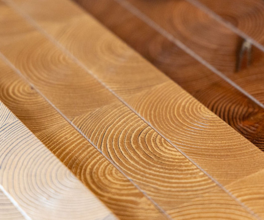
Listone Giordano, the renowned brand specializing in luxury wood flooring, has introduced Trafic, a vibrant new parquet collection designed by […] The post A timeless fusion: wood surfaces that unite history, modernity, color and form appeared first on DesignWanted.
It’s easy to love the Pantone Color of the Year 2024: Peach Fuzz is fresh, approachable, charming, soft, hopeful and even playful. Photo above: Peach Fuzz, Pantone Color […] The post Pantone Color of the Year 2024 Is a Friendly Choice for Interiors appeared first on Mindful Design Consulting.
a uniform warm yellow color palette maintains flexibility, with white walls for easy adaptation to evolving brand themes. The post abstract geometric stone informs the interiors of retail store by tens atelier in china appeared first on designboom | architecture & design magazine.
the streetwear brand's new flagship store features open spaces, velvet-draped walls, curved forms, glossy finishes, and a burst of nude project's corporate colors. The post el departamento goes backstage with new nude project flagship store in lisbon appeared first on designboom | architecture & design magazine.
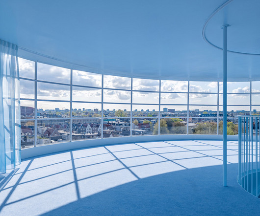
sited inside a renovated 19th-century building, the flagship forms a color gradient through each floor, starting with earthy tones at street level. The post NIO house’s amsterdam flagship by MVRDV culminates in an airy blue pavilion appeared first on designboom | architecture & design magazine.
everyday objects and blossoming buttercup bouquets are transformed into colorful fragments that enliven the surrounding streetscape. The post jacquemus cobalt blue pop-up flower shop in paris by paf atelier + yoann et marco appeared first on designboom | architecture & design magazine.
The name is fitting: The shop promises “bliss in every bite,” while its menu suggests a large variety […] The post Fun Dessert Bar Design Wows with Neon Signs and Vibrant Colors appeared first on Mindful Design Consulting.
A uniform with your store’s logo or colors reinforces your brand identity every time an employee interacts with a customer. Whether it’s a bold logo on the front of a t-shirt or a color that matches your brands identity, each uniform becomes a tool for spreading the word about your store, products, and services.
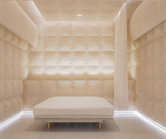
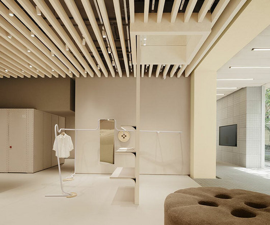
the agency opts for a grid-like structure with a monochrome color palette that focuses the consumer’s attention on the product itself. The post glass-reinforced concrete ‘pillows’ envelop this experience mattress store in shanghai appeared first on designboom | architecture & design magazine.
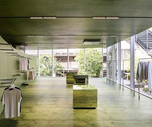
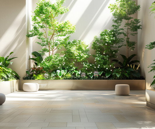
creative studio unravel blends the interior and exterior, using colors that dissolve these boundaries on the floors, walls, and ceilings. The post verdant green store introduces nature-infused shopping experience in tokyo appeared first on designboom | architecture & design magazine.
eastern-style textures and colors steadily constrast 'space station' details, creating a new form of eclecticism. The post the new HAYDON shanghai store seamlessly combines retro decor with sci-fi accents appeared first on designboom | architecture & design magazine.
the practice emphasizes this duality by injecting color gradients that recall a magnetic field. The post vang studios weaves raw & polished elements into tech-inspired store in argentina appeared first on designboom | architecture & design magazine.
Color palettes & earthy tones are in – creating mysterious, warm, safe spaces. Deep browns, mossy greens, muddy eggplants, and soft cinnamon/brick reds are some of the colors making up this rich and cozy palette. Think about the elements in your store that are eco-friendly, then tell their story. Bold is also in!
a vibrant, futuristic infusion of light and color creates an illusion of an undiscovered planet for an immersive retail experience. The post x+living crafts an immersive journey through space and time in POP MART’s shanghai store appeared first on designboom | architecture & design magazine.
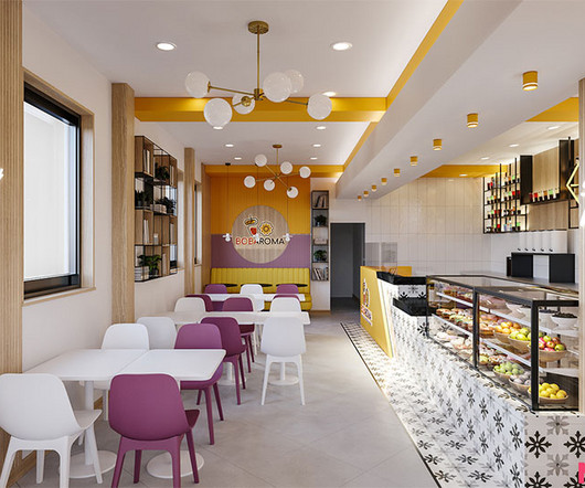
With a slightly larger square footage and more opportunities […] The post Cozy Boba Tea Store Design Pops with Bright Colors appeared first on Mindful Design Consulting.
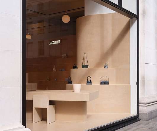
the floor-to-ceiling terracruda clay design boasts curving display shelves populated by jacquemus' latest colorful creations. The post jacquemus’ shop-in-shop at selfridges by OMA/AMO is clad in soothing terracruda clay appeared first on designboom | architecture & design magazine.
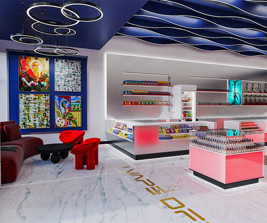
Responding to their need for a fresh look that would resonate with their vibrant clientele, we revitalized the store with a modern, colorful redesign. When iVape, a vaping supply store, decided it was time for a change, they turned to us to breathe new life into their space.
Through a thoughtful renovation of the existing store, the architects have breathed new life into the space by infusing it with the brand’s distinctive colors – red, yellow, blue, and […] The post F.O.G Architecture designs playful retail space in shanghai F.O.G
Use color psychology to get shoppers to associate your product with the holiday spirit , matching your brand colors to the hues associated with that season. For example, red, green and gold are common Christmas colors, while pastel pink and blue are typically Easter or spring shades.
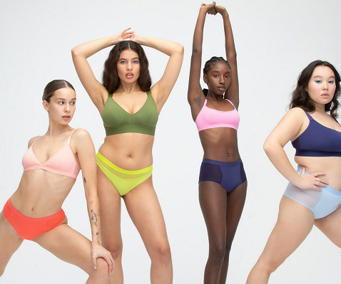
Over the last four years, the brand has built a strong direct-to-consumer and retail presence and loyal consumer base, thanks to its variety of brightly colored and boldly patterned intimates and other apparel, and a marketing strategy centred on micro-influencers and user-generated content.
Additionally, the color palette is completed by orange contrasts in the columns and shelf fixtures, adding dynamism to the spatial narrative. Fake Gods’ corporate cyan blue runs through the main corridor, defining the space from start to finish.
Fans will be eager to show their colors and leave the opposition in no doubt as to who they support. A host of different industries benefit from the game and some of these are obvious. For the two teams still involved, sales of merchandise will soar in the lead up to the big game.
The product pillar focuses on technical expertise from understanding garment construction to mastering color theory and the art of merchandising across categories. JK: Our training program is built on core pillars that form the foundation of our retail experience.
In the two digital campaigns, “Vote For Your Favorite Long Sleeve Polo Color” and “New Outerwear Collection for Fall/Winter 2020,” Lacoste sought to learn the fashion preferences of their consumers and how consumers prefer to wear their clothes. Vote For Your Favorite Long Sleeve Polo Color. Campaign objectives.
We organize all of the trending information in your field so you don't have to. Join 29,000+ users and stay up to date on the latest articles your peers are reading.
You know about us, now we want to get to know you!
Let's personalize your content
Let's get even more personalized
We recognize your account from another site in our network, please click 'Send Email' below to continue with verifying your account and setting a password.


Let's personalize your content