Remove Circulation Remove Interior Remove Texture
article thumbnail

AIA Estúdio designs cave-like interior for clothing store in Rio de Janeiro

Dezeen

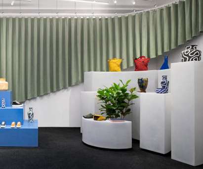
Organic shapes and stone -like surfaces characterise the interior of the Haight clothing store in Rio de Janeiro , which was designed by interior and landscaping design practice AIA Estúdio. Rather than being a cumbersome obstacle, the pillar helps organise the shop's circulation and movement of shoppers, according to the studio. "It

article thumbnail

WGNB creates minimal monochrome SVRN store in Chicago

Dezeen

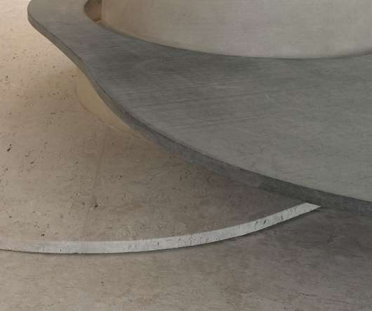
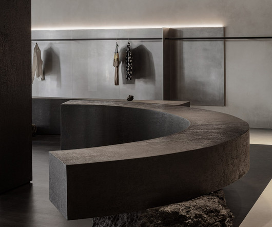
Micro-cement plaster paints are used to contrast the metal, adding a rougher texture against the smooth surfaces. The spatial layout of the store considers the current that customer's circulation creates in the space with the objects and openness," said the studio. Read: WGNB designs all-black flagship store for fashion brand Juun.J "The

Insiders

Sign Up for our Newsletter

This site is protected by reCAPTCHA and the Google Privacy Policy and Terms of Service apply.

article thumbnail

Jungle-like interiors define this chocolate store in Taiwan by Soar Design Studio

Design Wanted

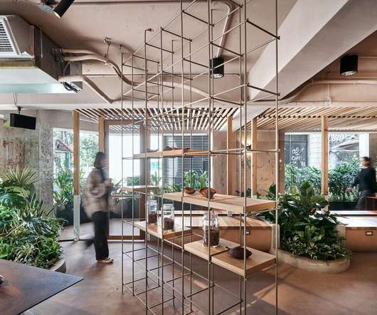
Only plenty of greenery and organic shapes seemed appropriate when designing the interiors of Terra Bean to Bar, a chocolate shop in Taiwan. Housed on the ground floor of a thirty-year-old apartment building, Soar came up with the idea of making the interiors look as though nature had invaded Terra Bean to Bar.

article thumbnail

Styled Habitat Unveils Nordic Homeworx’s Scandinavian-Inspired Showroom

Design Middleeast

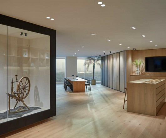
The renovation and expansion project aimed to encapsulate the essence of Scandinavian design, characterised by natural materials, subtle textures, and an abundance of natural light. Interior designers and homeowners alike thrive on visual and tactile inspiration, and the renovated showroom serves as a creative hub.

Texture 52
article thumbnail

First Asia Pacific Adidas Flagship in Myeongdong, Seoul

Retail Focus

Parallel linear metal strips conceptually derived from the iconic adidas logo as a key motif is not only highlighted on the facade, which extends all the way in, visible in many places among the shop interiors. The color combination of blue and red of the interior recalls the fitting rooms in a stadium.

Display 147
article thumbnail

SAY Studio Unveils New Inspiring Workspace for Reliance International in DIFC

Design Middleeast

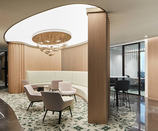
Elegantly Connected A feature staircase connects Levels 33 and 34, providing vertical circulation and access to meeting rooms. Different textures break the monotony of the space without creating visual interruptions. The private internal stairs are complemented by a pendant chandelier, adding elegance for visitors and employees.

article thumbnail

Collective installs stage in New York ONS Clothing store

Dezeen

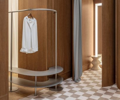
To balance the dark colours and textures of the flooring the studio has inserted pops of colour using light blue tiles on the changing room pods and blue and green counter surfaces. Collective is a studio that practices architecture, interiors and exhibition design founded in 2015.