Remove Circulation Remove Interior Remove Layout
article thumbnail

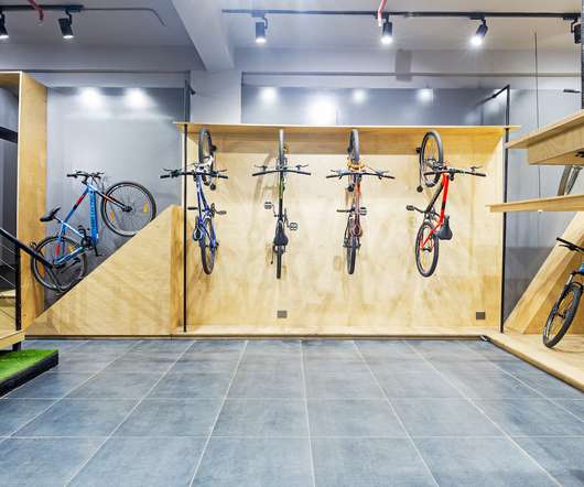
The new Vegas Sports showroom creates a quirky, exploratory shopping experience for sports lovers

Retail Focus

The design scheme employs subtle, subliminal hints that encourage people to explore the space: ample circulation space, and nooks that unfold within a meandering layout. . Derived from an open plan, this layout determines the viability of success for the design of the store.

Shopping 162
article thumbnail

Linehouse creates greenhouse-informed food market in Shanghai

Dezeen

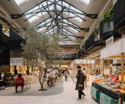
The same recycled red bricks sourced from demolished houses in China can also be found on the interior walls, stacked to create three dimensional patterns. The interior of the market was designed to resemble a greenhouse, with shops and cafe's arrranged around a central, double-height atrium.

Marketing 115
Insiders

Sign Up for our Newsletter

This site is protected by reCAPTCHA and the Google Privacy Policy and Terms of Service apply.

article thumbnail

Stu?ssy's Shibuya store interior by Perron-Roettinger draws upon the clothing brand's surfing roots

Dezeen

Green timber storage features throughout the store's interior. Perron-Roettinger , founded by Willo Perron and Brian Roettinger, wanted to create a store interior that encourages circulation and interactivity. Traditional layout of spaces is quite boring and it feels like the path is already chosen for you. The post Stu?ssy's

article thumbnail

Offhand Practice designs second-hand bookshop in Shanghai to mimic greengrocer

Dezeen

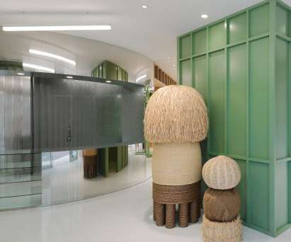
On the interior, Chinese architecture studio Offhand Practice hoped to create a relaxed shopping environment despite the large number of goods on offer, which includes more than 2,000 pieces of clothing. Read: AMO cocoons Jacquemus store in pillows to create "bedroom-like" interior.

Design 145
article thumbnail

WGNB creates minimal monochrome SVRN store in Chicago

Dezeen

The spatial layout of the store considers the current that customer's circulation creates in the space with the objects and openness," said the studio. The fourth wall in the rear space is reserved for displaying shoes, which sit on shelves of unequal heights that are silhouetted against backlighting.

article thumbnail

7 Office Design Strategies To Support Neurodiversity In A Post-Pandemic World

All Work

These strategies can range from layout and circulation changes to FF&E decisions, but the most important thing employers can do to create places where every individual feels valued and supported is to first understand the need and the opportunity. Example of a variety of work space options. Image courtesy of Elsy Studios.

Strategy 110
article thumbnail

Isern Serra completes "serene" office for Spanish eyewear brand

Dezeen

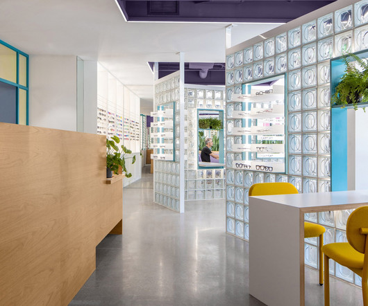
Sculptural custom-made furniture adds artistic flourishes to this otherwise minimal showroom and head office , designed by Spanish interiors studio Isern Serra for eyewear brand Gigi Studios. Rather than a typical office layout with rows of workstations, the large open spaces are separated into more intimate zones with a more domestic scale.