Remove Circulation Remove Concept Remove Contrast
article thumbnail

Aldi launches Corner Store in convenience push

Inside Retail

Discount supermarket Aldi is making a push into convenience with the opening this week of a Corner Store concept in North Sydney. The new store layout is designed to support smaller-basket, convenience-driven purchases, in contrast to the traditional big-box Aldi supermarket typically frequented by consumers for larger shopping trips.

Concept 264
article thumbnail

Vaga Arquitectura and Pistache Ganache wrap Brazilian store in undulating "membrane"

Dezeen

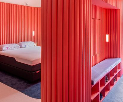
In contrast to the coral walls, plush dark blue carpet – experienced after customers remove their shoes when they enter – directs circulation between the spaces and leads to the secluded Blue Room in the back corner offering "an immersive and automated experience, with controlled sound, light, and temperature."

Insiders

Sign Up for our Newsletter

This site is protected by reCAPTCHA and the Google Privacy Policy and Terms of Service apply.

article thumbnail

Offhand Practice designs second-hand bookshop in Shanghai to mimic greengrocer

Dezeen

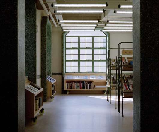
Both levels have an open-plan layout with circulation routes defined by shelving and clothes rails. Contrasting green tiles were used to frame the generous window openings revealed during the building's renovation, and to form integrated window seats. Books are displayed on the building's first floor and clothing on the second.

Design 145
article thumbnail

AIA Estúdio designs cave-like interior for clothing store in Rio de Janeiro

Dezeen

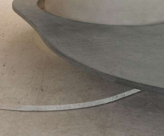
"The infinite and diverse processes of erosion that form cliffs, caves, stalactites, sands, stones and the movements of water with its tracks and shapes led to our creative process being part of the concept developed for the store's spatiality.". Stone slabs around the pillar are used to display objects.

article thumbnail

Bang & Olufsen Plants a Flagship in SoHo

VMS

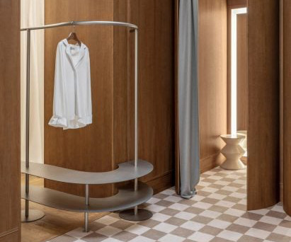
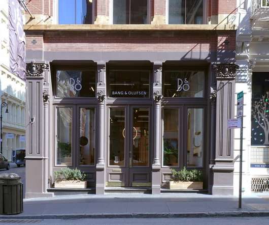
New York-based firm TPG Architecture, the project’s architect of record, implemented the concept. It plays with contrasts (think pale walls with a dark ceiling), and with shapes. Circular pedestal fixtures dot the floor, encouraging circulation while showcasing the brand’s range of products, down to the smallest wireless earphone.

Color 77
article thumbnail

Meet the winners of Taiwanese Golden Pin Design Award 2021

Design Wanted

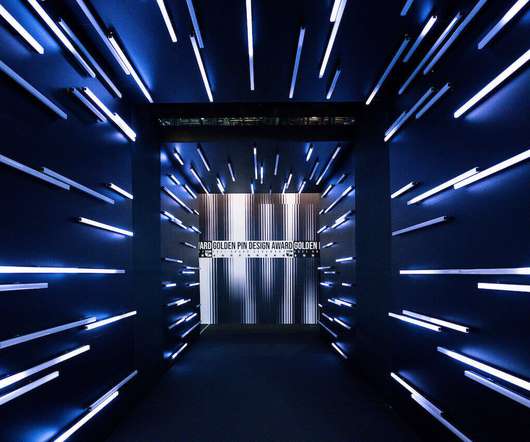
This year, the Golden Pin Design Award and Golden Pin Concept Design Award received nearly 8,000 entries in total from 28 countries around the globe, with many categories of designs in contention. The designs all showcased their ability to integrate concepts from differing fields. 2021 Golden Pin Concept Design Award.

Design 52
article thumbnail

From Cobblestones to Cyberspace: VMSD Celebrates Its 125th Year of Service to the Retail Industry

VMS

New York quickly became the epicenter of burgeoning new retail concepts. Within a few short months of its debut, circulation grew into the tens of thousands. In sharp contrast to the harsh realities of the Depression, the 1930s was the most elegant period in Hollywood’s history. And retail took its cues from the movies.