This site uses cookies to improve your experience. To help us insure we adhere to various privacy regulations, please select your country/region of residence. If you do not select a country, we will assume you are from the United States. Select your Cookie Settings or view our Privacy Policy and Terms of Use.
Cookie Settings
Cookies and similar technologies are used on this website for proper function of the website, for tracking performance analytics and for marketing purposes. We and some of our third-party providers may use cookie data for various purposes. Please review the cookie settings below and choose your preference.
Used for the proper function of the website
Used for monitoring website traffic and interactions
Cookie Settings
Cookies and similar technologies are used on this website for proper function of the website, for tracking performance analytics and for marketing purposes. We and some of our third-party providers may use cookie data for various purposes. Please review the cookie settings below and choose your preference.
Strictly Necessary: Used for the proper function of the website
Performance/Analytics: Used for monitoring website traffic and interactions
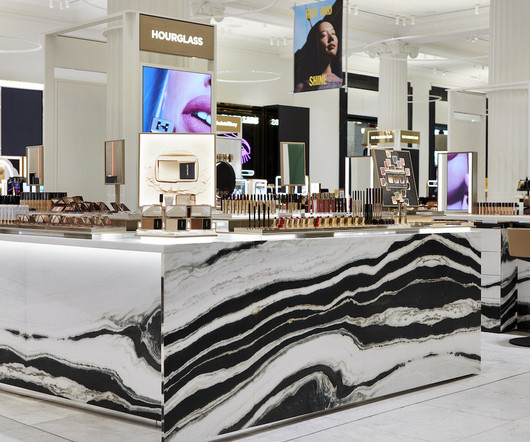
Having garnered a reputation for reinventing luxury cosmetics through cutting-edge product innovation and artful product design; they set out to establish a new retail standard in this highly-competitive market. Hourglass is a global leader in luxury, cruelty-free beauty. Visually arresting, and designed to standout.
A white terrazzo counter sits in the centre of the Malin+Goetz store in Silver Lake Formerly an auto body repair shop, the building's art deco facade on Sunset Boulevard was preserved during its conversion to retail.
Celebrating Bally’s 170-year heritage, Bally Haus honours the brand’s Swiss pillars of art, architecture and craftsmanship through contemporary design and natural materials. A focus on materials creates an open, flexible space with visual contrasts, a central Bally Haus feature.
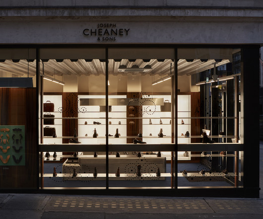
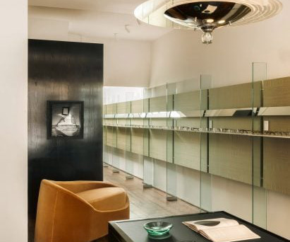
Perfectly capturing and expressing the essence of Cheaney’s craft, and displays their footwear with the reverence and curation one might expect in an art gallery. Luxury Shoe Gallery: The boutique’s gallery-esque displays showcase Cheaney’s footwear in a manner reminiscent of an art gallery.
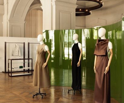
To create a striking visual contrast against the more neutral tones and materials, Halleroed added a velvet green sofa and a matching curved green screen with a high-gloss finish. Tubular lighting is very typical for art galleries and we wanted that feeling downstairs but in a more interesting, spatial way," said Halleroed.
By incorporating art throughout the store, Loewe aimed to reference its origins as a leather-making collective in the 19th century, as well as nodding to its annual craft prize. The post Loewe store in Seoul designed as "art collector's home" appeared first on Dezeen. The photography is courtesy of Loewe.
An inspired space to be Interior design studio Brahman Perera, the brains behind Sydney’s iconic Ursula’s Paddington decor collaborated with the Dissh to deliver an inspiring space that engages the senses and builds on the existing store concepts through ambiance, mood and layered contrasting.
Who said furniture isn’t art? Meta-luxury brand Visionnaire interrogates the relationship between art and design to create collectible ‘objects of desire’. And yet, for well over a century, artists and furniture designers have turned this maxim on its head, blurring the lines between art and design.
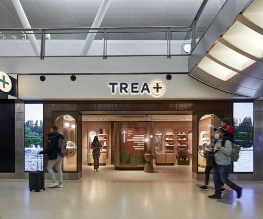
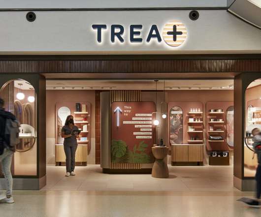
Shippit’s latest State of Shipping Report for 2024 offers a comprehensive look into current trends and challenges facing retailers, shedding light on how businesses can adapt and thrive in this dynamic environment. As economic pressures persist and competition increases, customer expectations for shipping and delivery grow.
Glass bricks with rustic metal lining are featured on the facade The facade features glass bricks lined with rustic metal elements, inviting natural light and framing views of the bustling retail street outside into the shop. In contrast, Neri&Hu created a cave-like shelter made of concrete for the 200-square-metre Woven Moonlight.
Dutch contemporary artist Levi van Veluw , the creator of inaugural window display art for Hermès’ at Nordiska Kompaniet, said, “the window becomes an experience.” A sense of contrast . The material adoption is perfect to illustrate the kaleidoscope in contrasting colors in the window campaign. . Longevity
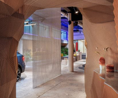
A mesh curtain separates the car from the rest of the showroom "The overall design is in intentional contrast to your average car dealership, with the spatial design as a louder experience than the actual product – the car," Spacon & X founding partner Svend Jacob Pedersen told Dezeen.
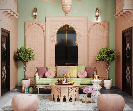
Whether it be atmospheric lighting, reimaging an indoor or outdoor majlis or adding arabesque touches to interior or table scaping. It is also the season to spend quality time in the home with loved ones and friends. Set the scene throughout your interior this Eid creating a festive feel.
"It's going to be a place where people can come in to get inspired by the mix of fashion, culture, art and design.". The 5,000-square-foot (465 metres) store includes retail space as well as art installations created for the store by Snarkitecture. The space used to be a warehouse. Recycled materials were used throughout.
A 1960s glass and chrome chandelier decorates Cubitts' Angel store "It's a long, slim room with an atelier atmosphere due to the strong contrasts of light and shadow," the studio's co-founder Oskar Kohnen told Dezeen. We didn't want to over-complicate the dynamic of the space," the studio's co-founder Felizia Berchtold told Dezeen.
A 1960s glass and chrome chandelier decorates Cubitts' Angel store "It's a long, slim room with an atelier atmosphere due to the strong contrasts of light and shadow," the studio's co-founder Oskar Kohnen told Dezeen. We didn't want to over-complicate the dynamic of the space," the studio's co-founder Felizia Berchtold told Dezeen.
The store's concept draws from the brand's Californian origins as well as European influences, which is reflected in the lighting , furniture and materials. We designed a long-curved glass like a contemporary insert which contrasts radically with the classic London pillars preserved," said the studio.
Curved resin walls define this retail space , which architecture studio Akin Atelier has created for the Sydney Modern extension at the Art Gallery of New South Wales. The translucent material allows natural light through the space. Stainless steel is used for display plinths, providing a contrast to the warm tones of the resin.
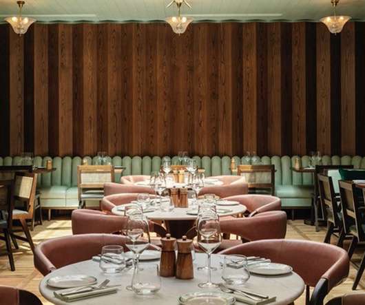
In contrast to the dark burgundy colour palette of the bar, the inner restaurant features a neutral colour scheme. And where the bar is well-lit with large windows, light is filtered in the restaurant area to create a more intimate space, the studio says. Each is then finished with custom designed lighting, seating and screens.
Say Architects has designed a concept store for Nice Rice in Aranya "Due to the individuality of the site and the splendid geolocation, we hope to bring the orange sea of Aranya inside and build a gold coast that never ends by using light as expression, creating undulating volumes, intertwining lights and shadows," the architects said.
The display counters were designed to resemble the shape of a fin and have an all-white finish that contrasts with the fishmonger's colourful walls. The red-and-white interior references the surrounding neighbourhood Despite designing the store to have a high-end look, the studio used deliberately simple materials as a contrast. "To
Our Farfetch Platform Solutions (FPS) and Store of the Future Teams have worked with Browns to bring FARFETCH’s state-of-the-art omnichannel retail technologies to the store to serve the changing needs of the luxury customer – both online and in this incredible physical space. It’s beyond fashion.
The first LA location for Boisson combines elements of mid-century Hollywood design and art deco in a 1,160-square-foot (108-square-metre) space to showcase a selection of non-alcoholic beverages. Light and shadow can become materials too and as if by magic, heavy things can become unexpectedly weightless."
Jimmy De Angelis navigates between art, technology and sciences to offer different products, such as the floor lamp Nest is. As humans, we have a fundamental attraction to light. At Milan Design Week, the multidisciplinary designer unveiled an interactive floor lamp that builds on this inherent attraction to light.
Designing with a striking color palette draws the eye inward, and incorporating various textures also adds visual contrast and uniqueness to the interiors. Lighting is another strategic way to invite people in — you don’t have to be limited to traditional overhead lighting. Image courtesy of Tom Minieri.
Charlotte Perriand's LC8 stool is among the vintage furnishings The functional and precisely detailed design of Cubitts' spectacles provided the main inspiration for the store, which also references the streamlined forms of Streamline Moderne – an aerodynamic offshoot of art deco that emerged in the 1930s. "We
Called Beauty Tales, a dramatic interplay of light and dark defines the fifteenth-century atmosphere inside Villa Arconati, which is known as the “petite Versailles of Italienne” located just outside of Milan where the striking images were shot. Who said furniture isn’t art?
Light wood tones paired with curvier lines and woven textiles were abundant. Bold patterns were not as contrasting as what we have seen before, but instead, slightly muted and serene. One of these pods was equipped with a reclining chair, headphones that streamed calming noises, and twinkling lights on the ceiling.
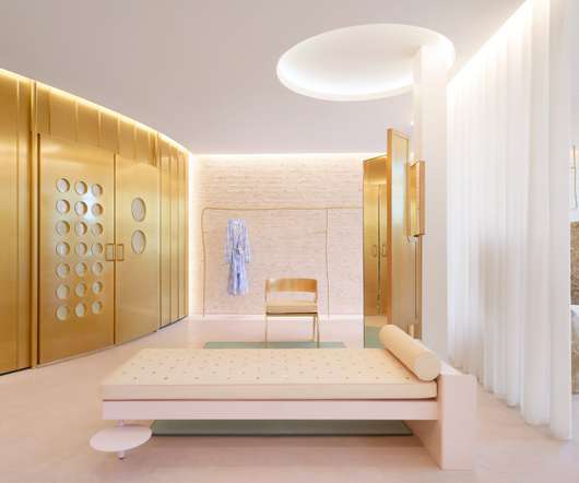
Light fixtures inspired by James Turrell artworks, balancing stones, and a circular golden changing room feature in the interiors of fashion brand Forte Forte 's Los Angeles boutique. Back-lit, circular openings throw light on the boutique, which, according to the designer, also take cues from an existing artist.
With its spherical gateway, limited palette and otherworldly lighting, the space was likened to a "desert planet" by Lialawlab's chief designer, Liya Xing. Italian fashion label Forte Forte 's art director Robert Vattilana designed its Los Angeles boutique based on the "volumes and lines of Californian modernism".
The design intentionally fuses modern aesthetics with sustainable materials and textures, providing a sensory experience that highlights the art of coffee-making." The showroom is divided into two areas The showroom is divided into two distinct yet interconnected areas. The photography is by Sarah Wijzenbeek.
Black terrazzo floors are contrasted against Sottsass veneer display cases. AMO described the space, which features both neutral and colourful spaces and contrasting combinations of textures and colours, as a space where "Parisian elegance" meets "industrial rawness". Blue metallic clothes rails are dotted throughout the interior.
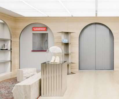
The store occupies two rooms divided by a freestanding wall of light-yellow travertine, which references the columns and beams found in classical architecture. Walls and floors are finished in raw concrete while overhead, a punctured grid ceiling conceals the store's lighting system.
Featuring contrasting white polished-marble stair treads, it twists through a circular opening to lead from womenswear on the ground floor to menswear and accessories on the first floor. In each, Sybarite follows the theme of opposites common in Joseph apparel with contrasting tones of black and white, and harsh and soft materials.
The ceiling’s highest points, creating the illusion that natural light is pouring into the ‘cave’. Contrasting the mega-scale urban space of vast roads and skyscrapers that surround it, the design provides an unexpected escape that offers an inviting and intimate experience. m deep display space that draws passers-by in.
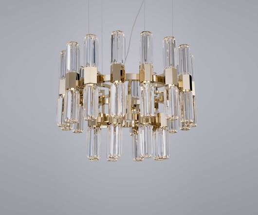
For some four decades, the Italian luxury lighting company has continued to partner with top designers to retain its unique appeal and creative DNA. Since 1976, Italian designer Patrizia Garganti has endeavoured to create one-of-a-kind lighting solutions , first as part of the incredibly successful laboratory BA.GA
At reception, a large-scale art piece presents an abstracted graphic interpretation of the lunar calendar. In the wider lobby and elsewhere, art pieces are strategically placed to evoke water reflections. An industrial theme runs throughout, and textures of brass and concrete are used to contrast with softer furnishings.
The material palette is layered, textured and warm with the use of tiles, plaster-look wallcoverings, fabrics, and colors like rose beige, brown, and bronze – a beacon of warmth in contrast to surrounding retail. lighting); Ana Maria Designs, Newport Coast, Calif. signage, art frames); Schluter, Plattsburgh, N.Y. Richmond, Va.
The material palette is layered, textured and warm with the use of tiles, plaster-look wallcoverings, fabrics, and colors like rose beige, brown, and bronze – a beacon of warmth in contrast to surrounding retail. lighting); Ana Maria Designs, Newport Coast, Calif. signage, art frames); Schluter, Plattsburgh, N.Y. Richmond, Va.
A skylight extends through the building core and bathes the space in natural light. The lighting plan, combined with the subdued color palette, underscore the sophisticated atmosphere. The lighting plan, combined with the subdued color palette, underscore the sophisticated atmosphere. Shinsegae Art Science, Daejeon.
Bar accents are “light and fresh” but still in keeping with the industrial undertones. These elements, like raw lighting and exposed pipelines, contrast with the “ultra glamorous” seaweed-toned marble bar top. Beyond the furnishings, lighting has played an important role in the building.
Depending on the type of wood paneling you choose to install, you can elevate the interior of your space by making your walls look like modern day wall art. The colors of the rustic wood paneling perfectly match the lighting for the decor. Dark Contrast. Contrasting wall panels. Rustic Color. Mixed barn woods.
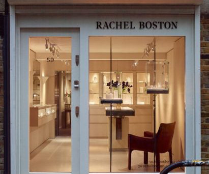
This larger 42-square-metre showroom in the back has a more relaxed and intimate feel that mirrors the art-deco style of Boston's jewellery. While the spaces contrast, the continuations of steel and limestone allow for a striking continuity throughout."
We organize all of the trending information in your field so you don't have to. Join 29,000+ users and stay up to date on the latest articles your peers are reading.
You know about us, now we want to get to know you!
Let's personalize your content
Let's get even more personalized
We recognize your account from another site in our network, please click 'Send Email' below to continue with verifying your account and setting a password.


Let's personalize your content