This site uses cookies to improve your experience. To help us insure we adhere to various privacy regulations, please select your country/region of residence. If you do not select a country, we will assume you are from the United States. Select your Cookie Settings or view our Privacy Policy and Terms of Use.
Cookie Settings
Cookies and similar technologies are used on this website for proper function of the website, for tracking performance analytics and for marketing purposes. We and some of our third-party providers may use cookie data for various purposes. Please review the cookie settings below and choose your preference.
Used for the proper function of the website
Used for monitoring website traffic and interactions
Cookie Settings
Cookies and similar technologies are used on this website for proper function of the website, for tracking performance analytics and for marketing purposes. We and some of our third-party providers may use cookie data for various purposes. Please review the cookie settings below and choose your preference.
Strictly Necessary: Used for the proper function of the website
Performance/Analytics: Used for monitoring website traffic and interactions
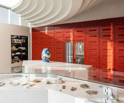
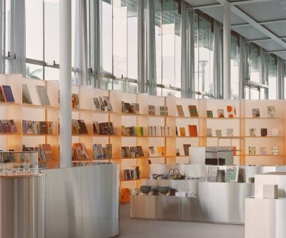
Spanish studio Mesura salvaged stone remnants of old fountains, archways and Gothic buildings to create the interior of this Aesop store in Barcelona. Located on the city's Avinguda Diagonal, the skincare store has been shortlisted for a Dezeen Award in the small retail interior category. The photography is by Maxime Delvaux.
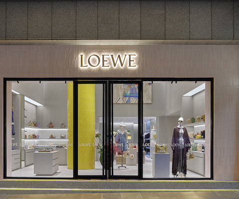
According to the brand, Loewe Melbourne is a new entry point into “the Loewe universe, where the house’s innate connection to art, craft, and design is brought to life” The interior features handcrafted ceramics, brass, and twisted iron contrasting with large glass windows and concrete floors.
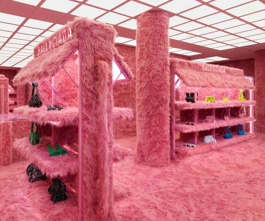
Celebrating Bally’s 170-year heritage, Bally Haus honours the brand’s Swiss pillars of art, architecture and craftsmanship through contemporary design and natural materials. A focus on materials creates an open, flexible space with visual contrasts, a central Bally Haus feature.
A white terrazzo counter sits in the centre of the Malin+Goetz store in Silver Lake Formerly an auto body repair shop, the building's art deco facade on Sunset Boulevard was preserved during its conversion to retail.
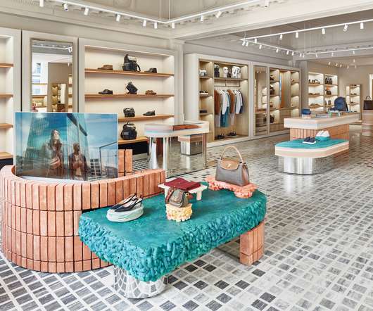
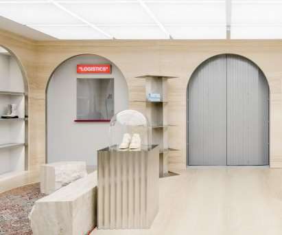
Tile-clad plinths and shelving features inside The interior spans three floors and also features a selection of brown, green and blue tiles, which clad blocky plinths and shelves displaying garments, bags and footwear. The post Loewe store in Seoul designed as "art collector's home" appeared first on Dezeen.
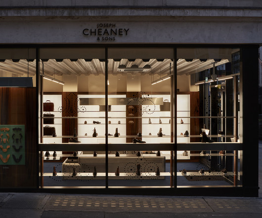
Perfectly capturing and expressing the essence of Cheaney’s craft, and displays their footwear with the reverence and curation one might expect in an art gallery. The boutique combines the heritage of English shoemaking with a sleek, contemporary interior that feels almost gallery-like. Nothing feels rushed or overly commercial.
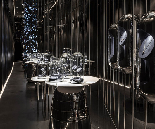
A pink furry fashion boutique, a cosmetics store styled like a 1970s office and a streetwear outlet adorned with a chandelier of Nike trainers feature in this roundup of weird and wonderful retail interiors. A large Klein-blue rock sculpture covered in non-reflective paint provides the focal point and adds to the interior's dreamlike feel.
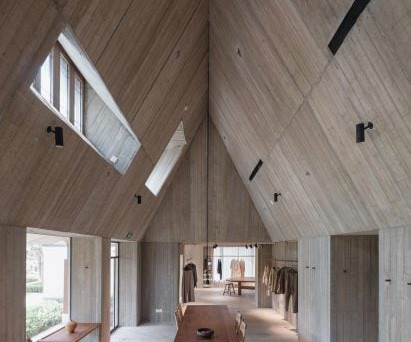
White oak furniture creates a warm interior A long table and benches made of white oak are placed at the centre of the space, with fashion garments displayed at the lower end of both sides of the roof. In contrast, Neri&Hu created a cave-like shelter made of concrete for the 200-square-metre Woven Moonlight.
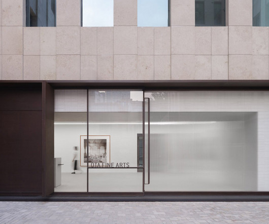
Chinese studio Neri&Hu has designed a contemporary art gallery for Ota Fine Arts in Shanghai with a focus on the "sublime beauty of the banal". Handmade ivory tiles line the inner side of the window in a subtle woven pattern, serving as a neutral backdrop for the art pieces.
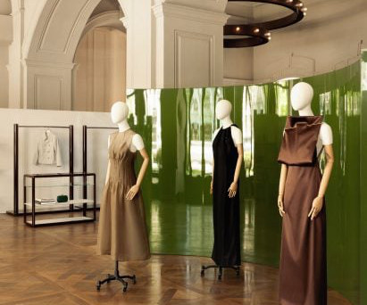
To create a striking visual contrast against the more neutral tones and materials, Halleroed added a velvet green sofa and a matching curved green screen with a high-gloss finish. Tubular lighting is very typical for art galleries and we wanted that feeling downstairs but in a more interesting, spatial way," said Halleroed.
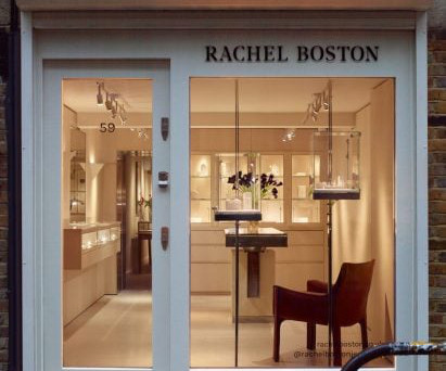
Interior design studio Hollie Bowden Interiors has created fine jeweller Rachel Boston's flagship store and showroom in London. Jewellery stores can be read as quite uninviting and exclusive," Hollie Bowden Interiors founder Bowden told Dezeen. "I The photography is by Richard Round-Turner.
Taking over a former art gallery in Fitzrovia, Natalino 's first physical store was designed to reflect the brand's garments. Read: Cúpla decorates Rixo Marylebone store with hand-painted murals When the interior eventually needs to be refurbished, the material can be easily removed by soaking it with water so it can once again be recycled.
French interior design Studio FB and the co-founder of fashion brand Frame, Erik Torstensson, have designed a California-informed store for the brand in London. We designed a long-curved glass like a contemporary insert which contrasts radically with the classic London pillars preserved," said the studio.
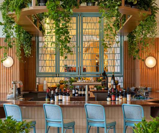
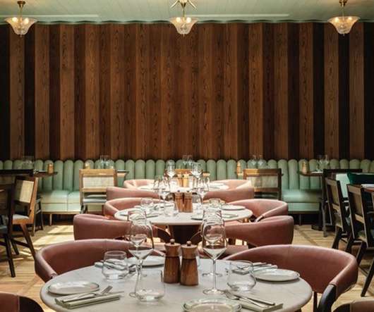
In contrast to the dark burgundy colour palette of the bar, the inner restaurant features a neutral colour scheme. Primo is the newest restaurant from award-winning chef Melissa Kelly, and the 215-seat dining space has been designed by interiors studio Dutch East Design. A natural stone countertop sits atop.
An inspired space to be Interior design studio Brahman Perera, the brains behind Sydney’s iconic Ursula’s Paddington decor collaborated with the Dissh to deliver an inspiring space that engages the senses and builds on the existing store concepts through ambiance, mood and layered contrasting.
He is an accomplished designer who studied arts in France 15 years ago before taking a job with a public relations consultancy in China’s capital, Beijing, where he worked on the account of Procter & Gamble, an FMCG company with a raft of hair and skincare products. That’s the best way to catch the attention of consumers.
Plants feature heavily in the interiors, and inspire the surrounding colour palette of neutrals and greens. Photo credit: Oculis Project Interior designer Pallavi Dean was inspired by the lunar calendar while designing the interiors for Dubai-based House of Originals Hotel, with her consultancy Roar.
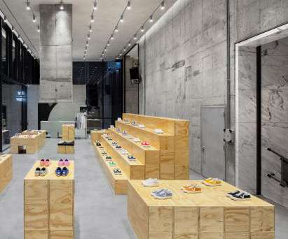
An 180-square-metre section of the building's ground floor has been turned into the Vans section, filled with plywood modules that can be combined in many different ways to create simple, adaptable interiors. The store's interior was designed to be connected to its surroundings. "At Its concrete walls were exposed.
It’s not just a practical resource but an employee perk, says Note Design Studio of its latest interiors project. The resulting space borrows ideas from both hospitality and work interiors, as the team sought to balance “function and atmosphere” Adaptable seating was key, the studio explains.
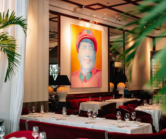
Crafted by Michele Bönan, a maestro of high-end interiors, the restaurant masterfully combines the charm of 1930s Shanghai with a contemporary twist. The interior design pays tribute to 1930s Shanghai, a city renowned for its high society and hidden opulence. Entering Shanghai Me is like stepping into a glamorous time machine.
Nahel Selo, Creative Director at Sedar Global shares top interior tips to get your home Eid- Ready Sedar Global Interiors explore how to work the top Eid dcor touches trending for 2025 Among many homes across the region, this spiritual month is a time for remembering and reviving traditional routines.
We live in a time where interiors are full of marble and precious finishes and I wanted to do the opposite," said the studio's titular founder. This room was designed to have a distinctly art deco feel with the help of a handful of clean, shapely details. The photography is by Alexander Edwards.
The Green Rooms is a new build-to-rent scheme located in Salford, and Manchester-based interiors consultancy 74 was recently tasked with designing its ground floor amenity spaces. It’s an extensive project, and includes the interior design of offices, a gym, a gallery and lobby. The Green Rooms, by 74. Basic-Fit Ladies, by UXUS.
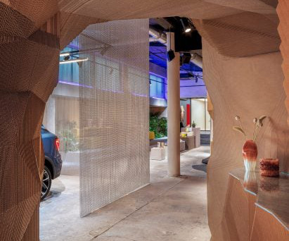
A mesh curtain separates the car from the rest of the showroom "The overall design is in intentional contrast to your average car dealership, with the spatial design as a louder experience than the actual product – the car," Spacon & X founding partner Svend Jacob Pedersen told Dezeen. "We
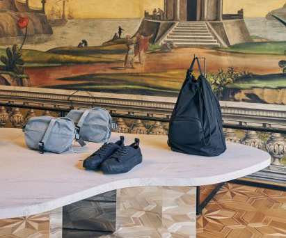
Fashion brand COS added an installation of mirrored plinths and display stands draped in layers of transparent mesh to enhance and contrast the interiors of the historic Palazzo Menz in Bolzano, Italy. The installation was designed to reflect and contrast the surrounding frescos.
Alongside, a fragrance library will offer a best-in-class selection of fragrance from around the world and a digital state-of-the-art beauty hydration bar will offer complimentary water infusions tailored to compliment customers skincare routines. Wolverhampton Frasers, Photography by Joas Souza Photographer.
The opening scene from a Wes Anderson film provided a starting point for the interior of this bottle shop in Los Angeles, by locally based Studio Paul Chan. A lamp by Gae Aulenti sits atop a custom glass block counter These materials are contrasted by thin stainless steel shelves upon which the products are displayed along both side walls.
Dutch contemporary artist Levi van Veluw , the creator of inaugural window display art for Hermès’ at Nordiska Kompaniet, said, “the window becomes an experience.” A sense of contrast . The material adoption is perfect to illustrate the kaleidoscope in contrasting colors in the window campaign. . Longevity
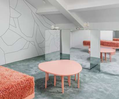
Art pieces by Leilah Babirye and Nika Neelova are suspended from the ceiling, placed between mirrored screens and positioned at the feet of cabinetry. These artworks gently break the store's rule of symmetry while adding natural and earthy hues, textures and forms against the largely grayscale interior.
Israeli architecture studio Baranowitz and Goldberg Architects has created Yama, a fishmonger in Tel Aviv with a sculptural interior that was informed by jewellery stores. The display counters were designed to resemble the shape of a fin and have an all-white finish that contrasts with the fishmonger's colourful walls.
The interior of the store is executed with vertically soaring rolled steel panels, which create a bold and abstract embracing backdrop for the central jewellery displays. The space features a monochromatic palette throughout, enhancing the jewellery pieces, and the reflective spatial arrangement encourages movement through the store.
Kaja Dahl combines craft, nature and technologies to create products that fall on the edge of art and design. Dahl graduated with a masters degree in Design for Luxury and Craftsmanship from ECAL in 2015 , after completing her bachelor in Product and Interior design at Beckmans college of Design in Stockholm.
Design studio Tutto Bene looked to surrealist artworks and Italian modernist exhibition design when creating the interior for this eyewear store in Islington, north London. Kohnen and Berchtold designed many of the furniture pieces personally for the interior, among them an undulating orange seat.
Design studio Tutto Bene looked to surrealist artworks and Italian modernist exhibition design when creating the interior for this eyewear store in Islington, north London. Kohnen and Berchtold designed many of the furniture pieces personally for the interior, among them an undulating orange seat.
Curved resin walls define this retail space , which architecture studio Akin Atelier has created for the Sydney Modern extension at the Art Gallery of New South Wales. Stainless steel is used for display plinths, providing a contrast to the warm tones of the resin. The translucent material allows natural light through the space.
It's going to be a place where people can come in to get inspired by the mix of fashion, culture, art and design.". The 5,000-square-foot (465 metres) store includes retail space as well as art installations created for the store by Snarkitecture. According to BBC, many of the elements used for the interiors were reused.
Egeberg was tasked with creating a work of art with an integrated desk that would attract the attention of passers-by." "It It brings a contrast to the clean shapes and surfaces of our point of sale," the team added. Our products are very clean, so to add contrasts to our stores, we use shapes and surfaces to create this duality."
Having previously designed stores for Nice Rice in Shenzhen, Chengdu and Shanghai, Say Architects conceived the interior as a response to the store's setting near the port city of Qinhuangdao , also known as the Aranya Gold Coast. The photography is by Wen Studio.
Russian architect Elena Lokastova has turned the attic space of a Moscow office building into a jewellery showroom with green-carpeted interiors, informed by the patinated copper dome of a monastery that can be seen from the window. The interior occupies an attic space. Mirrored display plinths stand at the heart of the space.
Black terrazzo floors are contrasted against Sottsass veneer display cases. AMO described the space, which features both neutral and colourful spaces and contrasting combinations of textures and colours, as a space where "Parisian elegance" meets "industrial rawness". Blue metallic clothes rails are dotted throughout the interior.
Be the contrast on your street. 2) Offer a Unique, Immersive Interior Concept with a Social Component Just because you sell tech, doesn’t mean your sales floor has to look flat, sleek and clean. That’s why creating a memorable customer experience is a critical factor in becoming a successful brick and mortar retailer. Be memorable.
Featuring contrasting white polished-marble stair treads, it twists through a circular opening to lead from womenswear on the ground floor to menswear and accessories on the first floor. In each, Sybarite follows the theme of opposites common in Joseph apparel with contrasting tones of black and white, and harsh and soft materials.
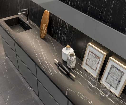
Dark tones define a luxurious bathroom interior – Collection Stones & more by Casa dolce casa, a brand of Florim Ceramiche. A luxurious bedroom interior uses contrasting black and white marble from the Classici di Rex collection. The B&W marble collection by Floor Gres adds character to a bathroom interior.
"The architectural language takes on local inflections and specific accents without ever becoming a dialect," Forte and Vattilana said of the way the interior of the store nods to its location. "We We also had an opportunity to work on unprecedented balances and harmonious contrasts. The rear of the store is lined in gold leaf.
We organize all of the trending information in your field so you don't have to. Join 29,000+ users and stay up to date on the latest articles your peers are reading.
You know about us, now we want to get to know you!
Let's personalize your content
Let's get even more personalized
We recognize your account from another site in our network, please click 'Send Email' below to continue with verifying your account and setting a password.


Let's personalize your content