This site uses cookies to improve your experience. To help us insure we adhere to various privacy regulations, please select your country/region of residence. If you do not select a country, we will assume you are from the United States. Select your Cookie Settings or view our Privacy Policy and Terms of Use.
Cookie Settings
Cookies and similar technologies are used on this website for proper function of the website, for tracking performance analytics and for marketing purposes. We and some of our third-party providers may use cookie data for various purposes. Please review the cookie settings below and choose your preference.
Used for the proper function of the website
Used for monitoring website traffic and interactions
Cookie Settings
Cookies and similar technologies are used on this website for proper function of the website, for tracking performance analytics and for marketing purposes. We and some of our third-party providers may use cookie data for various purposes. Please review the cookie settings below and choose your preference.
Strictly Necessary: Used for the proper function of the website
Performance/Analytics: Used for monitoring website traffic and interactions
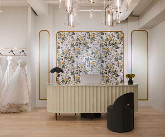
Arched antique brass window frames have been meticulously restored, preserving the architectural heritage and providing a breathtaking backdrop that feels both timeless and modern. The use of unique wallpapers was another critical design element that Hao incorporated to bring texture and warmth to the space.
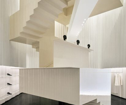
Herzog & de Meuron has designed Toteme Beijing, which opens today Designed by Herzog & de Meuron, which is led by Pritzker Architecture Prize -winning architects Jacques Herzog and Pierre de Meuron, the store is clad with blocks of white stone and metal layered in a pleated formation.
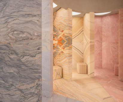
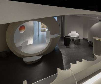
Architecture studio Mesura collected 78 pieces of stone from a defunct quarry nearby, where local family-run stonemason Barbany keeps remnants of demolished 19th-century structures. Instead, we celebrated the raw, authentic textures of the stone, enhancing its natural beauty and reinforcing its connection to the past," he told Dezeen.
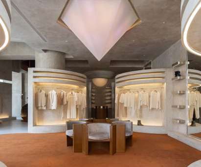
Grand steel and micro-cement structures, celestial lighting and symmetrical layouts add a sense of ceremony to the shopping experience within this clothing boutique in Hangzhou , China by Liang Architecture Studio. Simplistic, clear structures and pure textures together express the spatial aesthetics.".
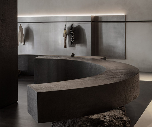
Architecture studio Modum Atelier has created the Moment boutique within a historic building that encloses a hidden courtyard in Nanjing , China. The mottled rust on the surface of the steel matches the tonality of the bricks, creating a sense of a texture that has been baptised by time," the studio told Dezeen.
British architecture studio Al-Jawad Pike has used colourful marble for the interiors of trainer brand Athletic Propulsion Labs’ second flagship store in Soho, New York City. The textured display plinths were developed with a bespoke fabricator based in New York, who CNC-carved the forms.
We believe that a cultural anthropological perspective can offer valuable insights that can enrich and shape architectural approaches during the current era of transformation. They consider the spatial layout, lighting, acoustics, and ergonomic aspects to create effective and inspiring workspaces.
Local architecture, climate, culture, and consumer habits all influence the configuration of commercial spaces. In each location, predominant materials, color palettes, and even lighting interact with the history and architecture of the area.
From architecture and interior design to marketing, Retail Design is far more than just about stores. A Retail Designer can transform a restaurant or bar into a space that evokes emotions and attracts diners through strategic use of colors, textures, and layout.
The quest to forge emotional connections through architectural design has long captivated the minds of architects and designers. Neuroaesthetics research shows how our brains react to art, including architecture, and the response to beauty. This article was written by Elina Cardet of Arcadis for Work Design Magazine.
The space was decorated using no colour; only different textures in similar colours were used to highlight the space level," Lialawlab 's chief designer Liya Xing told Dezeen. "It The studio created the Formoral store as a desaturated space with large structures, columns and counters finished in highly textured, grey paint.
A muted, monochrome selection of materials creates a serene atmosphere in both of the spaces, while the architectural elements dictate purposeful paths that connect them. Micro-cement plaster paints are used to contrast the metal, adding a rougher texture against the smooth surfaces.
Raw textures, industrial-inspired fixtures, and rustic design elements were used as visual markers of rebellion and creativity. At Pitfire, we showcased their brand values of being a rebel, a non-conformist and highlighting their ‘work hard, play-hard’ culture with the color palette, layout and textures used.
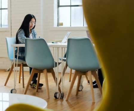
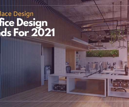
Resimerical features include: Mix of textures/silhouettes Natural light/ambient lighting Wool rugs, large curtained windows Classic house plants Comfortable seating Durable upholstery Natural fibers. In 2021, expect to see decorative touches associated with the home environment and comfortable furnishings, particularly in breakout spaces.
As we begin the new year, let’s look at some exceptional projects to look forward to in 2024 that are high on architecture, style, innovation, and creativity. In honouring the site’s memory, the architecture by Dabbagh captures the spirit of place.
Inspired by its situation within the MediaCityUK development, the 74 team has designed a narrative for the space that reflects local architecture. Familiar elements such as the green and yellow colour palette are staying put but new layouts and materials are being introduced.
All the main rooms are compositionally connected with each other with materials and textures. To achieve flexibility and avoid unnecessary division of this already compact apartment, the partitions have been (almost) completely removed, creating an open plan layout with one central module defining the main living space.
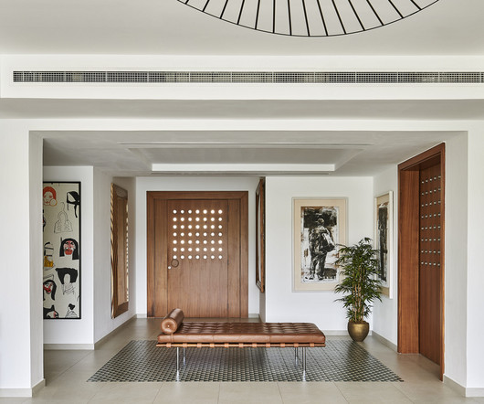
The layout is deliberately symmetrical to create balance and an atmosphere of conviviality. Place of pause The staircase, often a dismissible architectural element, gets a dramatic uplift in this residence. The centrepiece is a Barcelona Day Bed in golden tan leather, a 1930 classic by Mies van der Rohe.
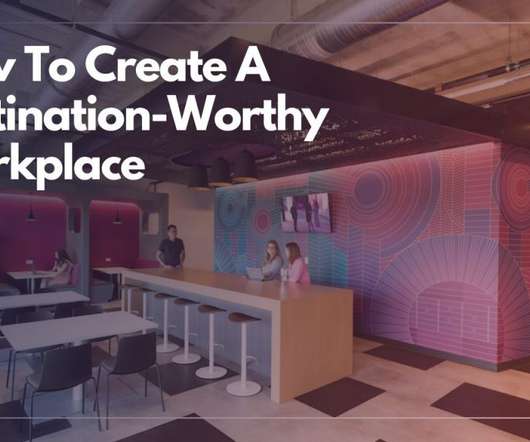
Consider this: the layouts and amenities of the best hotels and resorts are designed for optimal convenience, comfort and fun to keep people on property and capture more of guests’ dollars. Changes in volume, color, texture, lighting and even enclosure can all influence the kind of energy and dynamics of a workplace environment.
From architecture and interior design to marketing, Retail Design is far more than just about stores. A Retail Designer can transform a restaurant or bar into a space that evokes emotions and attracts diners through strategic use of colors, textures, and layout.
Guestrooms and suites emanate warmth and charm, with open layouts, vibrant hues, and artistic touches. Meanwhile, the Levantine restaurant East showcases the beauty of the region’s architecture through patterned floor tiles, pointed arches, and traditional lead windows.
Dave Alan Kopec of the New School of Architecture and Design in San Diego defines the psychology of space as “t he study of human relations and behaviours within the context of the built and natural environments.” Modular fixtures can be easily reconfigured to create new displays and layouts.
The focus is thus on the products; all design mechanisms such as spatial planning, shelf layout and product categorisation work towards the goal of yielding maximum profits at maximum efficiency. The store features a simple layout with light pebble-washed walls and flooring. Traditionally, the physical store is transaction-centred.
A storage area for frequently used supplies or the office of the manager who needs to approve everything, for instance, should be easily accessible in the office layout. Texture can add another dimension to colour, particularly in limited or monochromatic palettes.
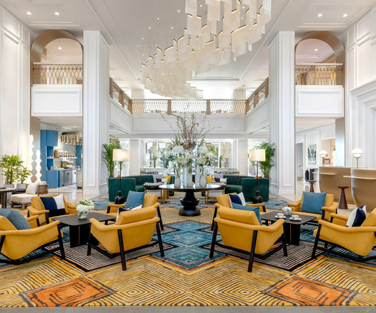
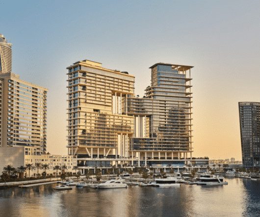
An architectural statement designed by Foster + Partners, the hotel represents the ultimate expression of trusted hospitality and elevated living, offering 225 rooms and suites and eight new dining concepts; including four that have been created with three of the world’s most celebrated chefs.
Inspired by its situation within the MediaCityUK development, the 74 team has designed a narrative for the space that reflects local architecture. Familiar elements such as the green and yellow colour palette are staying put but new layouts and materials are being introduced.
The office layout should allow ventilation flow through and around furniture. Smooth and shiny surfaces may make us feel as though a space is cooler whereas soft and textural materials make us feel warmer. Providing such materials and textures within the office space can help refresh a person’s state of mind. “A
One of the many ways of grabbing that much-needed attention is through the design and layout of your exhibit. Seamless Brand Integration If your unique brand identity requires specific colors, logos, shapes, and even literal textures, custom exhibits ensure that every particular element is seamlessly engrained with your brand.
While adding signage and displays may be among the first things that come to mind, the existing architectural elements of the entrance should not be overlooked, and may indeed be used creatively. It is also recommended to have movable rather than fixed shelves and displays to make it easy to adjust the store layout as needed.
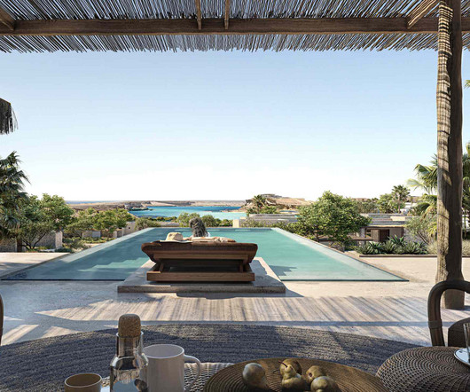
The architecture thus emerges from a process of listening, investigating, and materializing, revealing forms that shape not only built environments but also ways of inhabiting and coexisting with the surroundings. A concept that draws the “infinite” from the outside in, absorbing the amplitude of the sea and sky.
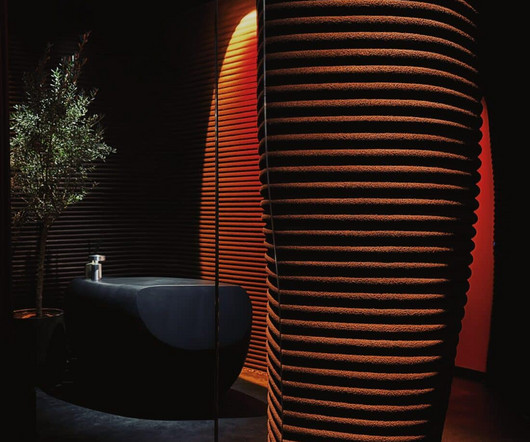
Each structure is crafted from recycled plastic and finished with textured paint, showcasing the potential of sustainable materials in luxury design. At the same time, indoors, they shape the layout, dividing the interior into separate chamber zones, shared Boris Lvovsky, CEO and co-founder of DA BUREAU.
Their clean, open architecture with minimalist wood and glass furniture ensures that products take center stage. In retail design, each tone and texture must be strategically selected to convey brand identity and reinforce the commercial proposition. Experiential zones Spaces dedicated to product and brand interaction.
We organize all of the trending information in your field so you don't have to. Join 29,000+ users and stay up to date on the latest articles your peers are reading.
You know about us, now we want to get to know you!
Let's personalize your content
Let's get even more personalized
We recognize your account from another site in our network, please click 'Send Email' below to continue with verifying your account and setting a password.


Let's personalize your content