This site uses cookies to improve your experience. To help us insure we adhere to various privacy regulations, please select your country/region of residence. If you do not select a country, we will assume you are from the United States. Select your Cookie Settings or view our Privacy Policy and Terms of Use.
Cookie Settings
Cookies and similar technologies are used on this website for proper function of the website, for tracking performance analytics and for marketing purposes. We and some of our third-party providers may use cookie data for various purposes. Please review the cookie settings below and choose your preference.
Used for the proper function of the website
Used for monitoring website traffic and interactions
Cookie Settings
Cookies and similar technologies are used on this website for proper function of the website, for tracking performance analytics and for marketing purposes. We and some of our third-party providers may use cookie data for various purposes. Please review the cookie settings below and choose your preference.
Strictly Necessary: Used for the proper function of the website
Performance/Analytics: Used for monitoring website traffic and interactions
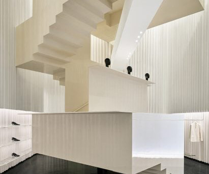
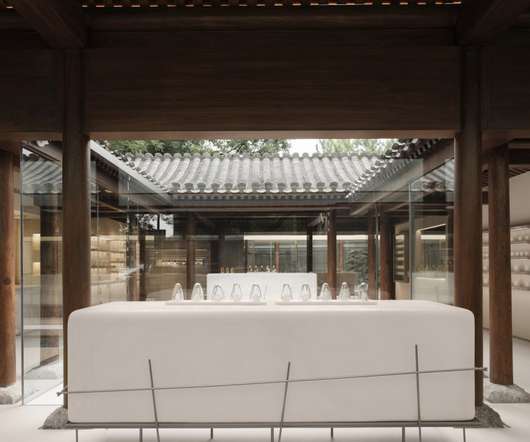
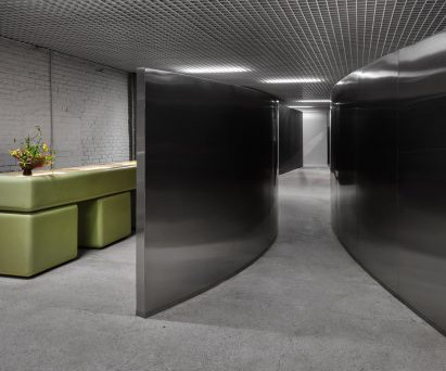
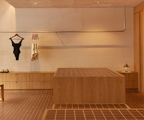
Herzog & de Meuron has designed Toteme Beijing, which opens today Designed by Herzog & de Meuron, which is led by Pritzker Architecture Prize -winning architects Jacques Herzog and Pierre de Meuron, the store is clad with blocks of white stone and metal layered in a pleated formation.
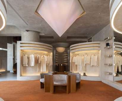
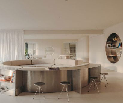
Grand steel and micro-cement structures, celestial lighting and symmetrical layouts add a sense of ceremony to the shopping experience within this clothing boutique in Hangzhou , China by Liang Architecture Studio. The micro-cement structures form the walls, ceilings and displays, pairing graceful curves with sharp geometric elements.
Awash with light and recast in a warm, welcoming colour palette, the new store boasts a spacious layout where one can discover the sixteen métiers of the house and the spirit of savoir-faire and innovation at the heart of Hermès.
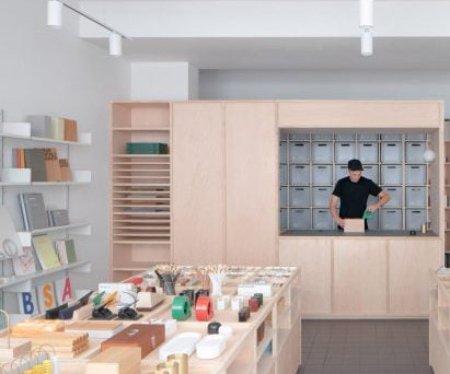
Local studio Architecture for London has designed an interior for stationery store Present & Correct in London , which features gridded joinery and draws on "wunderkammer" cabinets of curiosities. However, budgetary constraints meant that Architecture for London couldn't use hardwood for the joinery.
The store in the Californian seaside town references the area's famed natural beauty and Spanish-style architecture. The store's thoughtfully refined layout integrates two distinct storefronts into a seamless and cohesive retail experience, intentionally designed to elevate functionality and maintain aesthetic cohesion," said the studio.
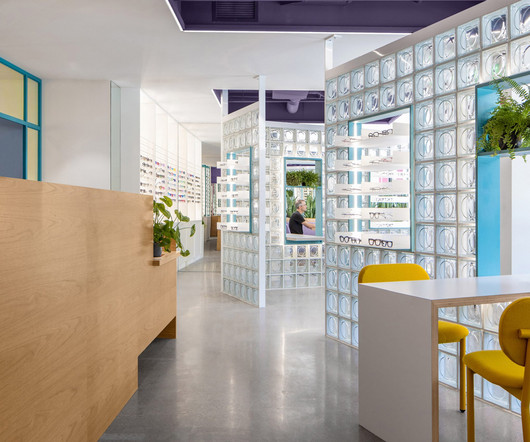
Local studio Best Practice Architecture has used punchy colours, glass bricks and dichroic glass inside an optometry store in Seattle 's Leschi neighbourhood. For Eye Eye 's second location, founder Will Pentecost got back in touch with Best Practice Architecture , which had completed the brand's first brick-and-mortar store back in 2015.
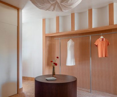
Architecture studio Modum Atelier has created the Moment boutique within a historic building that encloses a hidden courtyard in Nanjing , China. It gives customers the feeling of a cosy home atmosphere while allowing them to look at the surrounding clothing displays and the landscape outside the window, creating a unique experience."
Chinese studio FOG Architecture has turned a courtyard house in Beijing into a flagship store for fragrance brand ToSummer with exposed wooden roof trusses and columns. FOG Architecture was founded by Zheng Yu and Zhan Di and has offices in London, Shanghai and Chongqing. The photography is by InSpace Architectural Photography.
A lounge sits at the heart of the showroom's open layout A curved chrome reception desk welcomes customers at the store's entrance. Beyond, an open layout is organised around a central lounge to invite exploration of the different collections.
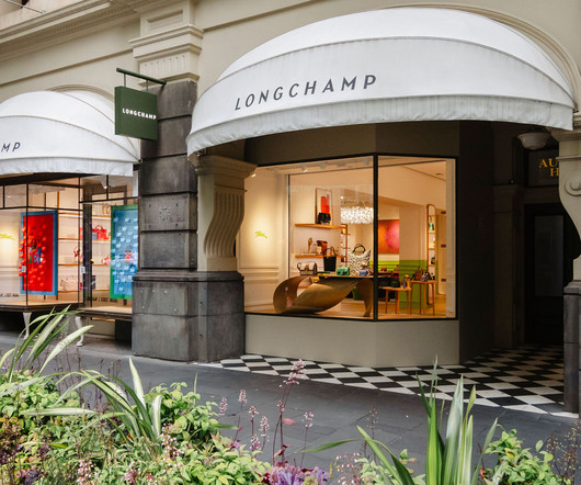
Amalgamation of art, design and comfort The brand’s subsidiary in Australia and New Zealand worked closely with Longchamp’s global and regional architecture departments to adapt the new store concept to the layout of the location layout and the heritage of the building.
Shanghai studio AIM Architecture has inserted a red staircase that resembles a children's slide in the middle of this clothing store to create a playful interior. Named In the Park, the Shanghai store was designed to reflect the playfulness of the clothing brand while drawing on the layout of traditional Chinese parks.
British architecture studio Al-Jawad Pike has used colourful marble for the interiors of trainer brand Athletic Propulsion Labs’ second flagship store in Soho, New York City. The textured display plinths were developed with a bespoke fabricator based in New York, who CNC-carved the forms.
In travel retail design, there are many aspects to consider regarding opening successful customer experiences, from the architecture dictating the shopfloor to lighting levels outside the space, retailers occupying sites nearby, retail design guidelines and of course, the duty free operator’s signature brand.
Used books are displayed in supermarket-style crates at the Deja Vu Recycle Store in Shanghai , which local studio Offhand Practice has designed to counter the "shabby" image associated with second-hand shops. Second-hand books are displayed in supermarket-style crates. The Deja Vu Recycle Store is located in Shanghai's Anfu Road.
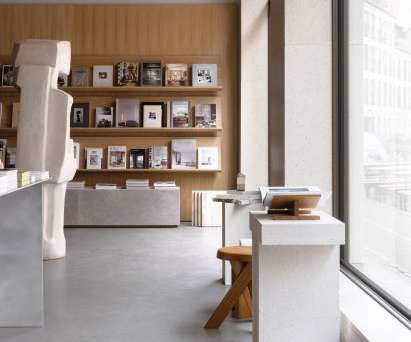
Wooden shelves and stone plinths are used to display books in the New Mags store. "As The only thing we had to work with from the existing architecture, was therefore the light golden sandstone used on the facade of the building and the somewhat irregular and fixed layout of the loadbearing concrete walls," he added.
Designed by leading Melbourne architecture and interior design firm, Cera Stribley, and built by The Melbourne Builder, the Armadale store features The Memo’s signature bright and bold colour scheme, while the layout has been thoughtfully planned with the customer in mind. Sydney is next on the cards,” Casey said. All about the flow.
Clear and fluid architecturallayout We prioritize clean lines, pure volumes, and intuitive flows. Functional yet emotional displays Furniture doesnt just displayit speaks the brands language , blends with the space, and conveys warmth. Custom furniture integrating samples into sleek yet tactile displays.
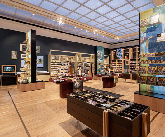
redesigned shop now serves as an integral part of the National Gallery experience, engaging and inspiring visitors with its multi-sensory, three-dimensional design that draws influences from the Gallery’s art, architecture, conservation techniques, and materials. The 194 sq.m An illuminated 3.6m
The Departamento store features custom elements like a green fibreglass and resin jewellery display Using the building's industrial bones to inform design decisions, 22RE took styling sensibilities of 20th-century modernists like Rudolph Schindler and Richard Neutra.
Studio FB designed a minimalist store for Frame "The Californian universe with these modernist architectures with a free plan, skylights and the opening of spaces to the outside was our inspiration basis," Studio FB told Dezeen. "We We imagined this new concept design layout as open as possible, which can be compared to a gallery."
Benches balanced on irregularly shaped rocks also act as product displays in the store "Spatial design of the SVRN store began with our interpretation of the SVRN's brand identity and narrative through the eastern perspective," said WGNB. Read: WGNB designs all-black flagship store for fashion brand Juun.J "The
Located on Ny Østergade in the city's old town, the flagship store belongs to jewellery brand Dulong and features an open-plan layout broken only by a few existing cast-iron columns. A colonnade stretches across the entire back wall of the store in a nod to the neoclassical architecture of Copenhagen. The walls were finished with clay.
A glow of inviting warm sunrise-shaded light complements the modern-minimalistic architecture and design elements that extend into the two fitting rooms, which have enough space to make any Bondi tenant envious. Mantras in brushed gold, cursive italic lettering adorn the displays to inspire and motivate.
Say Architects designed each floor with a symmetrical layout that enhances the calm and serene atmosphere within the store. Clothes rails on both sides of the room are designed to resemble breaking waves, curving outwards from the wall to create space for hanging clothes underneath.
French designer Pierre Yovanovitch has opened his first US showroom and gallery in Manhattan's Chelsea neighbourhood, displaying over 80 pieces from his own furniture brand. Throughout, exposed ceiling joists and ductwork are paired with dark wood flooring and whitewashed brick, typical of a New York loft space.
This data optimizes store layouts, product placements, and customer experiences. Personalized recommendations and interactive displays enhance customer engagement. Hyperphysical stores often feature interactive displays, such as touch screens, Augmented Reality (AR) and Virtual Reality (VR) experiences, or digital installations.
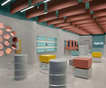
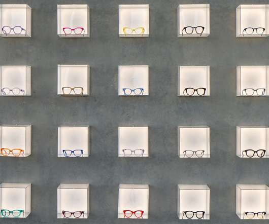
Colourful display stands are meant to appear like artworks within this eyewear store in Dhahran, Saudi Arabia created by French designer Pierre Brocas and architect Nada Oudghiri. Brocas and Oudghiri applied Eyewa's signature bright colour palette to wall display units made from powder-coated plywood.
Open for just 12 weeks, the architecturally designed store reflects Thankyou’s commitment to reimagining retail. The layout is carefully planned to create an immersive and engaging experience. The store’s layout is thoughtfully designed, with a ribbon wall separating the retail and service areas. Ganni Sydney Image supplied.
Arched doorways, altar-like tables and a nave-style display area feature in this Los Angeles showroom that McLaren Excell has designed for bathroom brand The Splash Lab. The display areas needed to feel integral to the architecture of the space and not afterthoughts within an independently conceived envelope," said the practice.
Neuro-architecture explores how art, color, lighting, and design can have a positive impact on our mood, productivity, and overall health. The theory of neuro-architecture explores how art, color, lighting, and design can have a positive impact on our mood, productivity, and overall health. All images provided by Novità Communications.
Read: Isern Serra turns renderings into reality to form pink Moco Concept Store in Barcelona Similarly, the building's central core is wrapped in a layer of built-in storage units including circular stainless-steel niches that incorporate shelves for displaying books and materials.
The Marylebone store features piles of green books The team took "material references" from the British Library on Euston Road and attempted to emulate the layout of traditional bookshops by choosing warm timbers and towering piles of pale green books to decorate the interior.
The studio organised the layout to accommodate the store's various functional areas and make a clear distinction between its public and private spaces. Textured grey paint defines the space. The gap is complemented with mirrored material, allowing customers to stay, wonder, stare and rest.". A tunnel leads customers through the store.
EGO Hair Salon, by IS Architecture and Design. IS Architecture and Design was briefed to turn a disused gym into a space age hair salon. Additionally, the team utilised this second location’s natural lighting, which the team says acts as a “natural spotlight” for the curated cannabis products on display.
An open-plan layout helps to blur the distinction between creative lab, gallery and concept store, resulting in a vibrant interior that is part showroom and part lounge. the showroom’s display wall is continuous and takes advantage of the entire store, allowing flexibility in organizing and the disposal of large products. Meanwhile, ??the
The first, called Cabinet of Curiosities, features a glass display case filled with objects and drawings, revealing the forms and images that inspire Hayon's designs. Now the layout of the house is set and every year we'll just adapt it," she added. The photography is courtesy of &Tradition.
Dave Alan Kopec of the New School of Architecture and Design in San Diego defines the psychology of space as “t he study of human relations and behaviours within the context of the built and natural environments.” Fixtures Fixtures provide the structure for displaying products.
Architectural elements within Mod Pizza locations pay homage to the original stores, while elements like a “Wall of Fame” with messages from the community create a local connection. Source a local artisan in each location to create and showcase a custom fixture, display, or work of art from identifiably local materials.
Accent lighting is used to highlight specific features, artwork, or architectural elements, adding visual interest and creating focal points within the space. Flexibility and Adaptability Commercial spaces often undergo changes in layout and function over time.
The set design was developed to complement the existing architecture of the station, and evoke the “aspirational aesthetic long associated with Hollywood”, according to Rockwell Group. Rockwell designed four separate spaces for the ceremony, which helped to minimised congregation throughout.
F or Heritage, a destination for bridal couture in New Delhi, India, the aim was to “marry indigenous details with a clean-lined layout to underline the merchandise,” says Dhruva Kalra, Principal Designer, I’m D’sign (New Delhi; formerly RMDK). Courtesy of RMDK, New Delhi. SOMETHING OLD, SOMETHING NEW. Dror Baldinger, San Antonio.
Inspired by its situation within the MediaCityUK development, the 74 team has designed a narrative for the space that reflects local architecture. Liqui explains that the intention was to create a contrast between the lab aesthetic and the “rustic quality of the artisanal bread”, which will sit on display behind the counter.
The focus is thus on the products; all design mechanisms such as spatial planning, shelf layout and product categorisation work towards the goal of yielding maximum profits at maximum efficiency. The store features a simple layout with light pebble-washed walls and flooring. Traditionally, the physical store is transaction-centred.
Accent lighting is used to highlight specific features, artwork, or architectural elements, adding visual interest and creating focal points within the space. Flexibility and Adaptability Commercial spaces often undergo changes in layout and function over time.
We organize all of the trending information in your field so you don't have to. Join 29,000+ users and stay up to date on the latest articles your peers are reading.
You know about us, now we want to get to know you!
Let's personalize your content
Let's get even more personalized
We recognize your account from another site in our network, please click 'Send Email' below to continue with verifying your account and setting a password.


Let's personalize your content