This site uses cookies to improve your experience. To help us insure we adhere to various privacy regulations, please select your country/region of residence. If you do not select a country, we will assume you are from the United States. Select your Cookie Settings or view our Privacy Policy and Terms of Use.
Cookie Settings
Cookies and similar technologies are used on this website for proper function of the website, for tracking performance analytics and for marketing purposes. We and some of our third-party providers may use cookie data for various purposes. Please review the cookie settings below and choose your preference.
Used for the proper function of the website
Used for monitoring website traffic and interactions
Cookie Settings
Cookies and similar technologies are used on this website for proper function of the website, for tracking performance analytics and for marketing purposes. We and some of our third-party providers may use cookie data for various purposes. Please review the cookie settings below and choose your preference.
Strictly Necessary: Used for the proper function of the website
Performance/Analytics: Used for monitoring website traffic and interactions
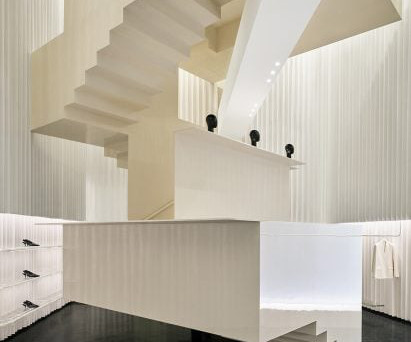
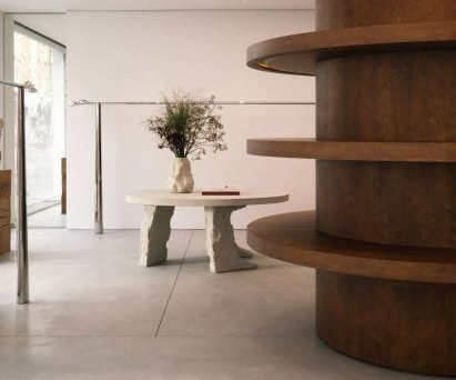
Herzog & de Meuron has designed Toteme Beijing, which opens today Designed by Herzog & de Meuron, which is led by Pritzker Architecture Prize -winning architects Jacques Herzog and Pierre de Meuron, the store is clad with blocks of white stone and metal layered in a pleated formation.
Architecture studio Mesura collected 78 pieces of stone from a defunct quarry nearby, where local family-run stonemason Barbany keeps remnants of demolished 19th-century structures. Textured white stucco was chosen for the walls and ceilings to contrast with the sleeker white-tiled flooring.
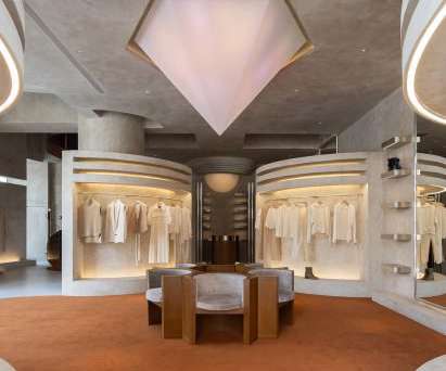
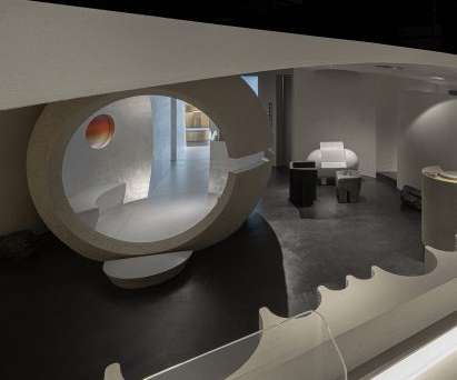
Grand steel and micro-cement structures, celestial lighting and symmetrical layouts add a sense of ceremony to the shopping experience within this clothing boutique in Hangzhou , China by Liang Architecture Studio. The post Liang Architecture Studio creates retrofuturistic boutique in Hangzhou appeared first on Dezeen.
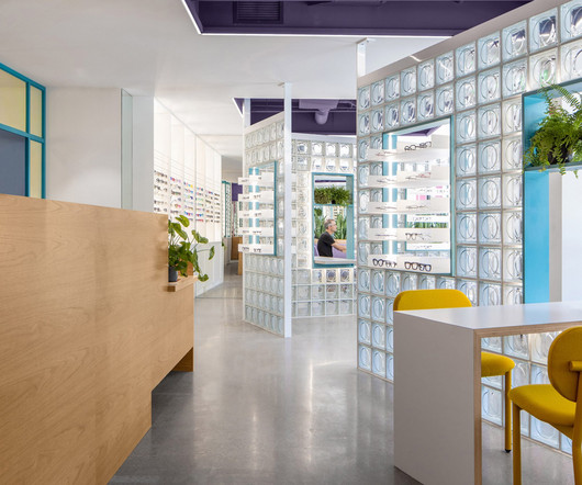
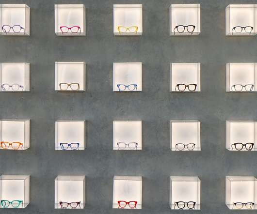
Local studio Best Practice Architecture has used punchy colours, glass bricks and dichroic glass inside an optometry store in Seattle 's Leschi neighbourhood. For Eye Eye 's second location, founder Will Pentecost got back in touch with Best Practice Architecture , which had completed the brand's first brick-and-mortar store back in 2015.
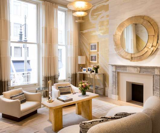
Behind its typical London facade, the atmosphere evokes Parisian elegance with all the charm of a grand Victorian mansion, unfolding in a unique layout. On the ground floor, the noble materials contrast with digital screens that replace the traditional cases to show off the Maison’s creations in a modern manner.
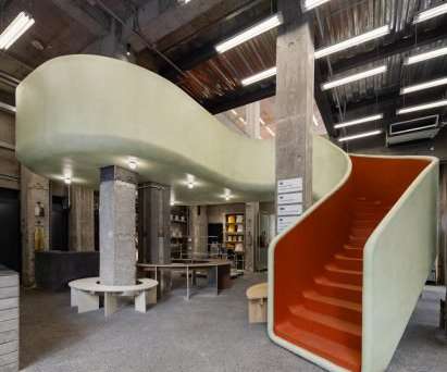
Shanghai studio AIM Architecture has inserted a red staircase that resembles a children's slide in the middle of this clothing store to create a playful interior. Named In the Park, the Shanghai store was designed to reflect the playfulness of the clothing brand while drawing on the layout of traditional Chinese parks.
A lounge sits at the heart of the showroom's open layout A curved chrome reception desk welcomes customers at the store's entrance. Beyond, an open layout is organised around a central lounge to invite exploration of the different collections.
Architecture studio Modum Atelier has created the Moment boutique within a historic building that encloses a hidden courtyard in Nanjing , China. Outdoor water-brushed stone is used for the flooring, its rough texture contrasting the wooden pavilion and enhancing the outdoor aesthetic. "We
On the interior, Chinese architecture studio Offhand Practice hoped to create a relaxed shopping environment despite the large number of goods on offer, which includes more than 2,000 pieces of clothing. Both levels have an open-plan layout with circulation routes defined by shelving and clothes rails.
The local architecture studio wanted to transform the "silo-like" interior of the 100 square-metre space, which is set in a newbuild in inner-city Copenhagen , into a more easily manageable space that would also function as an office for New Mags ' marketing department. "The The bookshop is located in central Copenhagen.
Studio FB designed a minimalist store for Frame "The Californian universe with these modernist architectures with a free plan, skylights and the opening of spaces to the outside was our inspiration basis," Studio FB told Dezeen. "We We imagined this new concept design layout as open as possible, which can be compared to a gallery."
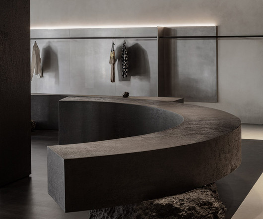
A muted, monochrome selection of materials creates a serene atmosphere in both of the spaces, while the architectural elements dictate purposeful paths that connect them. Micro-cement plaster paints are used to contrast the metal, adding a rougher texture against the smooth surfaces.
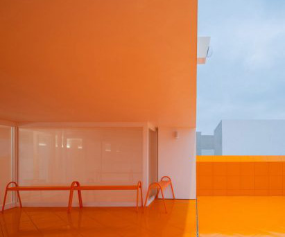
A glazed entrance provides a view into the store, where bright orange surfaces create a vibrant contrast with the shop's monochrome exterior. Say Architects designed each floor with a symmetrical layout that enhances the calm and serene atmosphere within the store.
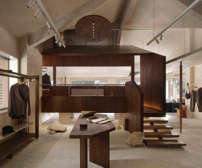
"Inside, 22RE leans into the original architecture's industrial elements through a deconstructivist lens," said the studio. While the layout follows a typical grid, the designers have inserted a variety of partitions, volumes and displays that "disrupt" the flow and encourage shoppers to explore.
It was envisioned as a contrasting yet unified whole, which breaks the homogeneity of physical retail spaces in modern cities and explores the deep relationship between nature and the artificial.". Light reflected through glass prisms creates patches of rainbow-coloured light. "The Textured grey paint defines the space.
The set design was developed to complement the existing architecture of the station, and evoke the “aspirational aesthetic long associated with Hollywood”, according to Rockwell Group. Image courtesy of Spencer Lowell for Rockwell Group A contrasting, cool-toned outdoors.
F or Heritage, a destination for bridal couture in New Delhi, India, the aim was to “marry indigenous details with a clean-lined layout to underline the merchandise,” says Dhruva Kalra, Principal Designer, I’m D’sign (New Delhi; formerly RMDK). Dror Baldinger, San Antonio. LOOKING FORWARD.
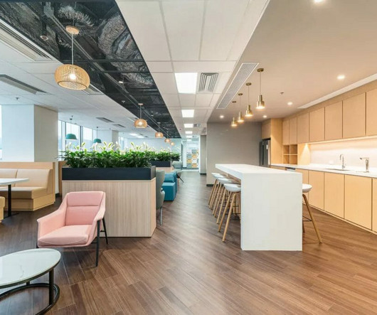
The traditional, rigid, and uninspiring office layouts of the past have given way to a modern approach that prioritises functionality, employee well-being, and aesthetics. Traditional office spaces typically adhere to a conventional layout and design, often featuring closed-off cubicles or individual offices for employees.
Guestrooms and suites emanate warmth and charm, with open layouts, vibrant hues, and artistic touches. Sinuous sofas elegantly contrast with the geometric forms and patterns of the curated joinery and case goods that embody a modern Middle Eastern style.
Inspired by its situation within the MediaCityUK development, the 74 team has designed a narrative for the space that reflects local architecture. Liqui explains that the intention was to create a contrast between the lab aesthetic and the “rustic quality of the artisanal bread”, which will sit on display behind the counter.
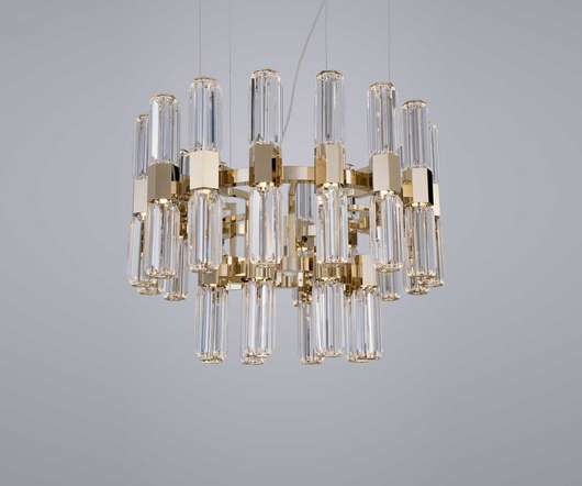
Patrizia Garganti will exhibit Coup de Foudre, a precious chandelier made up of voluptuous cornucopias contrasted by a metallic structure at Supersalone 2021. As well as Novecento and Gisele, Patrizia Garganti will exhibit Coup de Foudre , a precious chandelier made up of voluptuous cornucopias contrasted by a metallic structure.
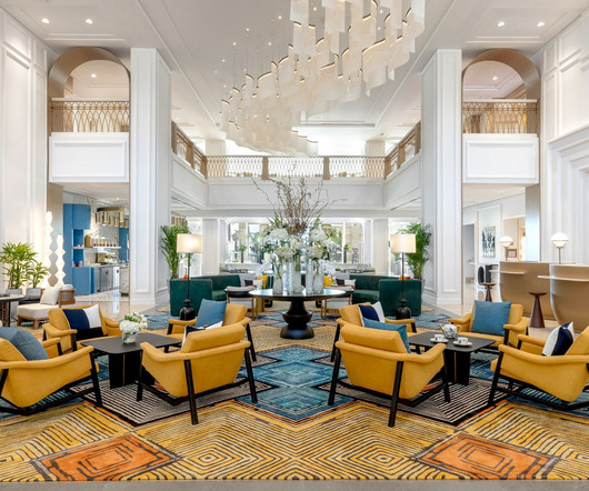
A country that is truly a marvel of contrasts and delights. The convention center includes 19 halls and offers a highly flexible layout accommodating many different events. This architectural feat provides ample space for any major event, demonstrating the true scale at which Koelnmesse operates. Sometimes, both go hand in hand.
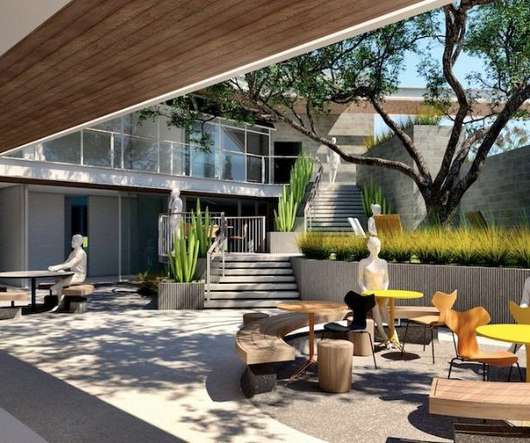
In contrast to years past, where most architects were directed by developers to sacrifice individual and communal outdoor space for the sake of maximizing density and leasable area, we are now seeing developers demand design where outdoor space is prioritized over leasable surface area. A Conscious Awakening Across CRE Design.
Inspired by its situation within the MediaCityUK development, the 74 team has designed a narrative for the space that reflects local architecture. Liqui explains that the intention was to create a contrast between the lab aesthetic and the “rustic quality of the artisanal bread”, which will sit on display behind the counter.
Key sectors benefiting the most include: Architecture, Engineering, and Construction: These professionals have used HP Large Format Printers for decades for their high-resolution technical drawings with high accuracy and color consistency.
We organize all of the trending information in your field so you don't have to. Join 29,000+ users and stay up to date on the latest articles your peers are reading.
You know about us, now we want to get to know you!
Let's personalize your content
Let's get even more personalized
We recognize your account from another site in our network, please click 'Send Email' below to continue with verifying your account and setting a password.


Let's personalize your content