This site uses cookies to improve your experience. To help us insure we adhere to various privacy regulations, please select your country/region of residence. If you do not select a country, we will assume you are from the United States. Select your Cookie Settings or view our Privacy Policy and Terms of Use.
Cookie Settings
Cookies and similar technologies are used on this website for proper function of the website, for tracking performance analytics and for marketing purposes. We and some of our third-party providers may use cookie data for various purposes. Please review the cookie settings below and choose your preference.
Used for the proper function of the website
Used for monitoring website traffic and interactions
Cookie Settings
Cookies and similar technologies are used on this website for proper function of the website, for tracking performance analytics and for marketing purposes. We and some of our third-party providers may use cookie data for various purposes. Please review the cookie settings below and choose your preference.
Strictly Necessary: Used for the proper function of the website
Performance/Analytics: Used for monitoring website traffic and interactions
Fabric textures can influence the perception of colors, so creative visual merchandising concepts select and combine different fabrics with building a story for retailers. A sense of contrast . The color combination of beige and metallic tones brings masculinity to match the brand’s image. Easy to obtain . Longevity .
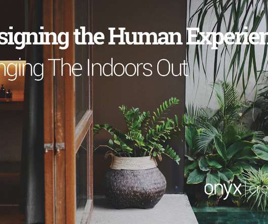
Accessories such as outdoor rugs, throws, pillows and plants can enhance the atmosphere and make the space feel more comfortable and cozy, like the indoors. Biophilic design can take this to the next level with the inclusion of natural elements, contrasting textures and materials, and wood features.
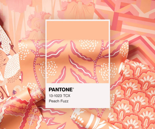
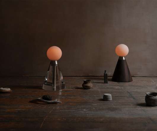
How to Incorporate the 2024 Color of the Year “Peach Fuzz” into Your Custom Packaging Pantone selects an iconic color every year to influence product development and purchasing decisions in multiple industries. Start by considering how “Peach Fuzz” can serve as either a primary or accent color.
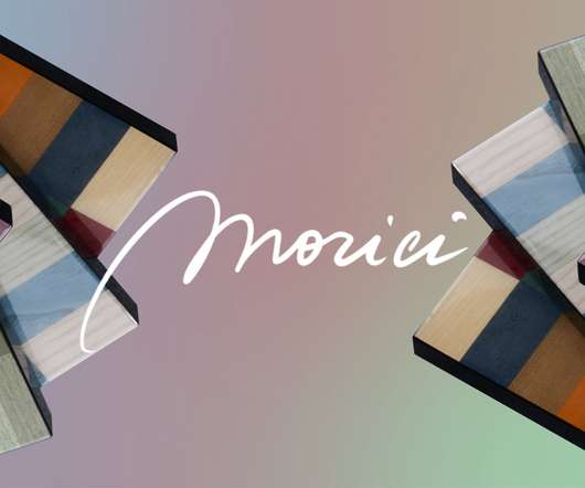
Founded in Le Marche amongst a breathtaking backdrop decorated with idyllic hilltop towns in 1979, the beautiful Italian landscape has long been an inspiration for luxury accessories and furniture brand Morici. Juxtaposing precious woods of different textures and colors, the collection conceptualizes nature within a dynamic framework.
Founded in 1979, Italian furniture and accessories company Morici is the place where Italian master artisans and modern production technology meet. Italian furniture and accessories company Morici offers a beautiful combination of elegance, contemporary luxury and unmatchable craftsmanship. Who is Mirco Morici?
A contrasting touch-sensitive, stainless steel switch connects the two elements which “ represents the human relationship between Earth and space,” says Fernandez. Mexico is a place full of contrast, elements and culture. Because they transmit pure artisan craftsmanship, color and form in the most minimal and seamless way,” she says.
“After many years with Linneys in our design team, there’s a lot of things you learn about working with the pink diamonds – it’s better to set them in rose gold, and you need the contrast of color of the white diamond so you can appreciate the pink hue.” All considerations that have been crafted into the quokka. “It’s
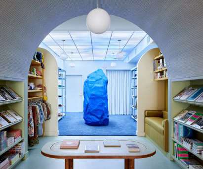
The Dreams interior was informed by daydreams and the surrealist aspect of dreams, with in-store accessories such as a lobster phone that nods to artist Salvador Dalí's 1938 artwork. Dreams features warm terracotta hues and a contrasting blue sculpture. It took many printer samples to get the right color, ink opacity and sheen.".
Choose the Correct Display for Your Products Once you know what to focus on, choose a fitting display for your products and related accessories to enhance your campaign’s visual appeal. Learn what colors resonate with them, what drives their purchases and how to incorporate this information into your display.
In just a few simple clicks, it’s possible to buy a vast selection of unique pieces selected from the best Italian craftspeople, from living room furniture to bedroom accessories and so much more. Viadurini ’s offering is extensive, including furniture, lighting , accessories, linen, and even heating solutions.
Also, use dark ink to produce contrast for the best exposure. Consider wrapping clothing or textiles in tissue paper, glassware in sturdy boxes, and accessories in small padded containers. Color is crucial when it comes to promoting your goods. The color red evoked feelings of excitement, passion, and vigor.
It’s there that he collected slag, the clumps of waste metal left behind in the production of metal, which he used to create a series of colorful candlesticks for Saatchi Gallery’s Collect fair. He came back with a bag of cement , which over the years has helped him define rough-luxe tabletop accessories including mirrors, bowls and lamps.
High end accessories fashion designers. The light in the soft color of her pieces, their reflections and the different contrasts, create a feeling of esthetic purity, equilibrium and lightness Is a globetrotter designer and map obsessed adventurer, born in Italy that holds a colorful passport having lived all over the world.
After all, it did start out furnishing entranceways in the sixties, an origin story that also helps explain the German brand’s incredible use of color. Bright, plentiful and not afraid to play with contrast , this approach captured our attention when we discovered Schönbuch’s pop-up showroom during Milan Design Week.
With the collection, Urquiola plays with the materiality of natural stone, endowing it with incredible lightness and a juxtaposition of color between the stone and metallic inserts that make up the joints. “ The result is a fascinating and eclectic array of multi-coloured mirror-cum-masks. The Village Collection.
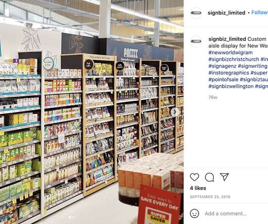
It involves improving floor plans, aisle spacing, store graphics, colors, displays, lighting, and technology to provide an exciting shopping experience for customers. A cohesive theme, tasteful displays, and a consistent color scheme can give your c-store a unique personality. This, in turn, can help you rise above the competition.
It involves improving floor plans, aisle spacing, store graphics, colors, displays, lighting, and technology to provide an exciting shopping experience for customers. A cohesive theme, tasteful displays, and a consistent color scheme can give your c-store a unique personality. This, in turn, can help you rise above the competition.
Housed in a converted army barracks with high ceilings, black cagelike grills as racks, and a colorful ‘cashier’ hut, customers would be forgiven if they mistake this for an art gallery. The boutique uses contrasting textures and flexible furniture in blush palette that make the space Insta-worthy. Address: Block 18, 18 Dempsey Road.
Elena Salmistraro – ‘Hephaestus’ It is the love for the work that stands in contrast to a deceptive and illusory world, made up of ephemeral pleasures and vices, Olympus. The material is white stoneware that can be molded by casting or turning and is in second firing, treated with an opaque coral-colored glaze.
We organize all of the trending information in your field so you don't have to. Join 29,000+ users and stay up to date on the latest articles your peers are reading.
You know about us, now we want to get to know you!
Let's personalize your content
Let's get even more personalized
We recognize your account from another site in our network, please click 'Send Email' below to continue with verifying your account and setting a password.


Let's personalize your content